
Performance Divergence Among Asian ETFs
One of the nice things about ETFs is the broad diversity they offer in terms of exposure to a vast variety of stock sectors within the US — but they also have exposure to a growing number of international countries (and in some cases, multiple choices within a single country or region), commodities, currencies, volatility, bonds, etc. All of which can be traded in a single brokerage account (or brokerage retirement account). In general, we tend to look for outperforming and underperforming ETFs for our specific option trades in the ETFTRADR program — as well as non-correlated prices moves, among other factors.
One example of a interesting divergence performance we've seen recently is among a few of the different single country ETFs within Asia. This is just an example, we see divergences and outperformance/underperformance like this occur all the time.
Take a look at the chart below, which depicts the Relative Performance of China ETF (FXI), Thailand ETF (THD), South Korea ETF (EWY) and Malaysia ETF (EWM) since mid-October. Far from being monolithic, there increasingly over time is diversity among performance in single countries within Asia, Europe, etc.
[FXI is red, THD is purple, EWY is green, EWM is yellow]
FXI vs THD vs EWY vs EWM Since October Market Bottom, Relative Performance Chart
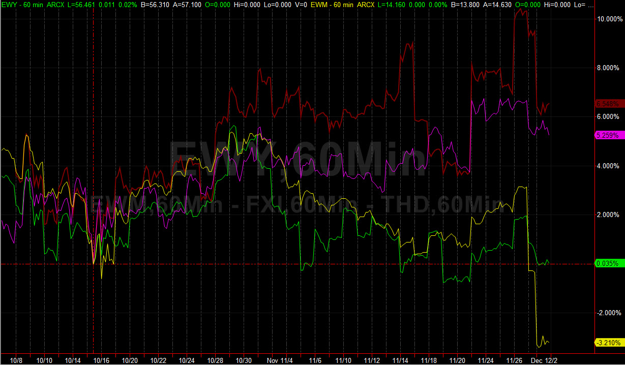
Now, all of these ETFs are underperforming the S&P 500 ETF (SPY) over this time frame, we're not saying this chart is giving a screaming 'buy' on any of them. But it clearly shows you would have done well in FXI & THD since the October rapid whip reversal, while in EWY or EWM you would be either breaking even or down — and this doesn't include the leverage we get with option trading strategies.
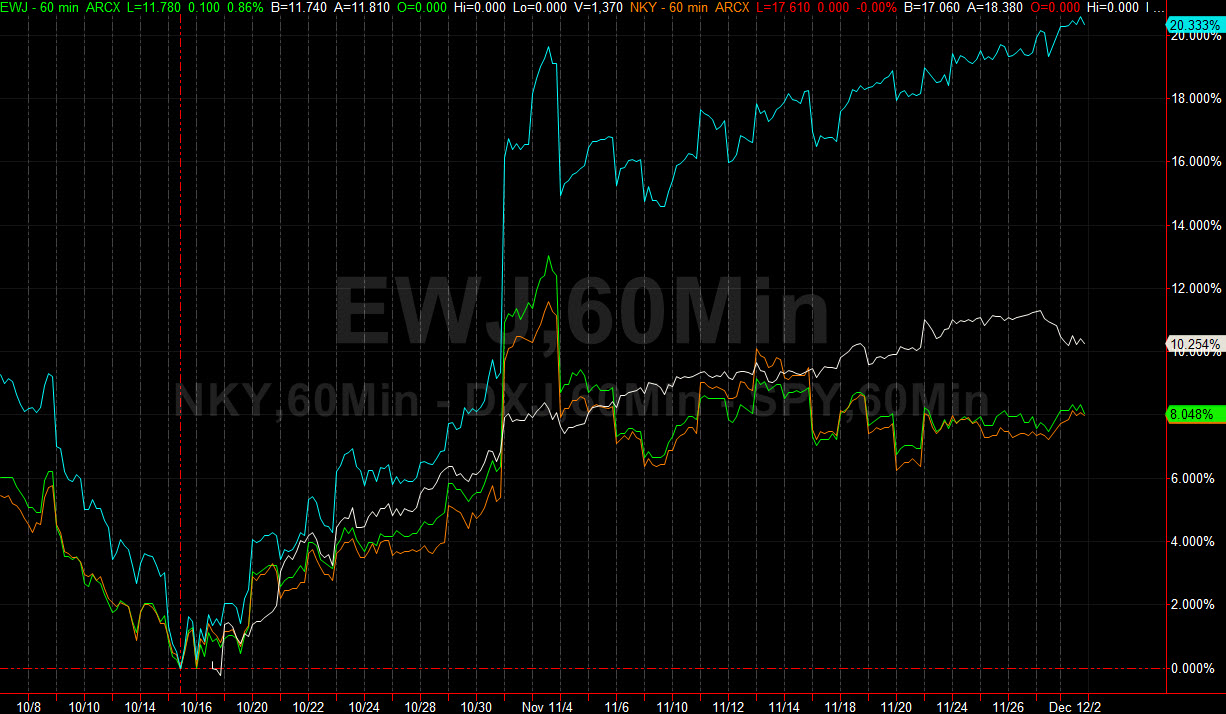
Here is another example on the chart below, just within Japan ETFs there are divergences going on — over the same time frame, Japan Hedged Equity ETF (DXJ) is strongly outperforming other Japan ETFs such as (EWJ) & (NKY) — but also outperforming the SPYders.
[DXJ blue, SPY white, EWJ green, NKY orange]
DXJ vs SPY vs EWJ vs NKY Relative Performance Chart
There are structural factors among ETFs (sometimes important ones) that can influence or magnify the performance divergences seen above. Looking at the 'charter' of an ETF and things like the Top 10 holdings and levels of exposure to individual companies is one way to ascertain this.
For example, as part of its structure, DXJ attempts to neutralize exposure to the Japanese Yen relative to the US Dollar. The lack of currency exposure is pushing this recent outperformance relative to the 'regular' Japan ETFs, at least a good portion of it.
And with the China, Malaysia, Thailand, South Korea ETFs listed above — FXI, EWM, THD have similar % allocations to their Top 10 holdings, for example — but EWY is more heavily weighted to 1 large company: Samsung, with 22% of the holdings in that one stock. So due to its current market cap, Samsung will tend to have a larger influence on the performance of the EWY ETF, both positive and negative.
Finding non-correlated price moves and outperformance/underperformance divergence is a key to finding the profitable trends, in both directions, that can really diversify your investing and trading portfolio. And with the growth of ETFs expected to continue (and particularly as there are more liquid and varied International & Commodity ETFs), there will be increasing opportunities to find these profitable trends in the future. As an example, in the next 5 to 10 (or 20) years, there may be as many different niche China sectors & ETFs available to US traders and active investors as there are varied sector ETFs within the US stock market.
Disclosure: None.


