
Inside Q1’s Punk GDP Numbers—Why Bubble Vision Doesn’t Get It
Promptly upon release of Friday’s GDP update, Steve Liesman and his Wall Street economist pals spent 10 minutes bloviating about why the negative print should be completely ignored. Herein is an essay on why it is they who should be given the heave-ho.
According to Liesman & Co the GDP shrinkage reported by the BEA for Q1 was all a mistake due to winter, strikes and unseasonal seasonals. So don’t sweat the small stuff, they brayed to what remains of the CNBC audience, the US economy actually continues bounding along at a 2.5% growth rate, as it has for the entire recovery.
Well, hold it right there. I am all for ignoring the quarterly jerks and flops embedded in the GDP data, too. But if you want to talk trend and context—-let’s do exactly that. And first and foremost there is no such trend as 2.5% growth.
After all, Liesman and his Wall Street cronies have been cheerleaders for the Fed’s insane 80 months of ZIRP and massive QE on the grounds that extraordinary measures were needed to combat the deep economic plunge known as the Great Recession. In fact, measured from peak to trough, the latter was the worst downturn since 1950. Real GDP shrank by 4.2% compared to an average of 1.7% during the previous nine recessions, and handily topped the 2.6% decline in 1981-1982 and the 3.0% decline in 1973-1975.
So you would think that after a recessionary plunge that was in a league all by itself that some account of that would be taken in assessing the recovery. Indeed, that’s particularly pertinent in the present instance because the depth of the Great Recession was exacerbated by a violent inventory liquidation in the fall and winter quarters right after the Wall Street meltdown in September-October 2008.
In fact, fully one-third of the $636 billion (2009 dollars) real GDP decline from peak to trough was accounted for by inventory liquidation; real final sales dropped by a far more modest 2.8%. Accordingly, the appropriate way to measure the trend is to remove the violent inventory swings from the numbers, and then to look at the path of real final sales after the peak—-averaging in the down quarters and the subsequent rebound.
Well, the present cycle is not even close to the purportedly favorable, steady eddy 2.5% trend that the bubblevision commentariat was gumming about again this AM. The compound annual growth rate over the 29 quarters since the pre-crisis peak in Q4 2007 is just 1.0%.
That’s right. This recovery is pinned deep in the sub-basement of history. During the comparably deep recessionary cycles of the late 1950s, mid-1970s and early 1980s, as shown below, real final sales grew at 3-4% annual rates over the 29 quarters subsequent to the pre-recession peak.
That is, the US economy dug out of its recessionary hole via several years of above trend rebound, thereby generating a 29- quarter gain that amounted to a cumulative 25-30 percent expansion. During the current cycle, by contrast, there was no compensatory rebound, just a languid climb from a deep recessionary hole.
Cumulative growth in real final sales has been only 8%. There is no 29-quarter period even remotely this bad since the early 1930s.
Indeed, what is truly notable about the chart is that the next weakest cycle on the chart is the subpar gain of 2.0% per annum for 2001-2008. During that period the Fed expanded its balance sheet in an unprecedented manner from $500 billion to $900 billion but got a housing boom and bust, not an improvement in real growth.
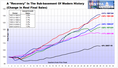
A “Recovery” In The Sub-basement Of Modern History – Click to enlarge
Throwing the rule-book of sound money to the winds, it then ballooned its footings by 5X to $4.5 trillion during the current cycle, and got even less to show for it. That is, a 1% economy, and that’s on the generous side. During the same 29 quarter period, the BEA claims the GDP deflator advanced at only a 1.5% annualized rate. Throw in some windage for a more honest and accurate pick-up in the economy-wide price level, and you have an economy that is essentially impaled on the flat line
Needless to say, a flat-lining economy is utterly incompatible with the Wall Street/Washington recovery narrative. Yet since today’s real final sales number, which clocked in at a negative 1.1% rate for Q1, further dramatized that unwelcome truth—it was simply ignored. The MSM financial commentariat, exemplified by Liesman and Wall Street’s so-called economists and strategists, is simply too invested in the Fed’s bubble finance policy model to even notice what is really happening.
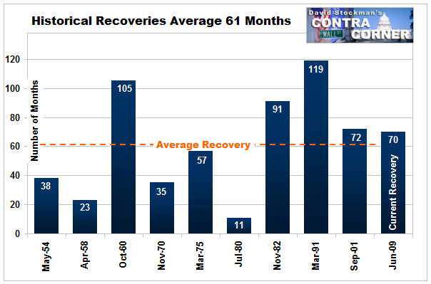
On that score, another thing which is really happening is that the current sub-basement recovery is getting long in the tooth from both a calendar perspective and relative to leading indicators that really matter, such as inventory ratios, productivity trends and the quality mix of hiring gains.
The bullish chatter today was that since job gains have allegedly been so robust, the long awaited—and perpetually delayed—-escape velocity is just around the corner. But why do these purported financial experts keep assuming that the BLS’ one job/one vote establishment payroll number actually measures economic progress?
The fact of the matter is that as of the first quarter, labor hours in the business sector were essentially no higher than in Q2 2000. During the last 15 years, they US economy has been bicycling the same old labor hours; all the labor hour gains since the recession bottom have been born again hours, not additional inputs to economic growth.
![]()
The implicit assumption in the escape velocity mantra is that the US economy has all the time in the world—-that there will never be another recession. Therefore the index line shown above will keep rising indefinitely, transforming born again labor hours into actual gains.
Why? This expansion at 70 months is already long in the tooth from a calendar perspective, and faces the near certainty that ZIRP will eventually end and that the dollar will rise with it.
In fact, the jobs report is a lagging indicator, and most especially in the present US business world dominated by a stock market obsessed C-suite. Just like in the run-up to 2008, they are over-inventorying labor, believing that the stock averages are forecasting higher sales and demand around the corner.
Unfortunately, what is around the corner is a flaming meltdown of the Fed’s third financial bubble this century. When the markets finally break, we will witness once again a dual liquidation of excess labor and stockpiled goods.
Indeed, we are already at the highest ratio of business inventories to final sales since October 2008. It is only a matter of time before a black swan shows up in the casino, causing the stock averages to plunge and the C-suites to lunge into another panicked liquidation of labor and goods, as they did in late 2008
![]()
Here’s the irony. Now that the household credit channel of monetary policy transmission is over and done due to the arrival of “peak debt”, the Fed’s flood of credits conjured from thin air never leave the canyons of Wall Street. They reflate the casino, not main street.
The resulting false signals of returning prosperity, in turn, cause stock option obsessed business executives to indulge in their own form of irrational exuberance. That’s especially true for those in the service trades which cater to the top 10% of consumers which account for 40% of total consumption spending and 85% of financial assets.
In short, the MSM cheerleaders like Liesman and his pals cannot see the handwriting on the wall because central bank bubble finance has essentially abolished the old rules of macro-economics. Someone should tell them.
Disclosure: None.


