
Fed’s Fantasy Vs. Reality
- Missed It By That Much – “Dow 20,000”
- Fed’s Fantasy Vs. Reality
- Sector Analysis
- 401k Plan Manager
Review & Dow 20,000
Last week, I noted the market’s push toward the market milestone of 20,000. To wit:
“The Dow broke above 19700 and is within striking distance of the ‘psychological’ summit of 20,000. With just 250 points to go, it is extremely likely traders will try and push stocks to that level by Christmas. Woo Hoo!”
The markets came just 30 points shy of hitting that number before retracing slightly mid-week. As “Get Smart” used to quip:
Seriously, it really was just that close.
I still suspect there is enough bullish exuberance currently to push the Dow to 20,000 and the S&P to 2,300 by the end of the year. However, I am more concerned about what happens next.
In Tuesday’s post, “Bullish Or Bearish,” I discussed several charts with respect to the market. However, this was the most important with respect to what I believe may occur after the inauguration in January.
“I have discussed previously the importance of ‘price’ as an indicator of the market ‘herd’ mentality. One of the major problems with fundamental and macro-economic analysis is the psychology of the “herd” can defy logical analysis for quite some time. As Keynes once stated:
‘The markets can remain irrational longer than you can remain solvent.’
Many an investor has learned that lesson the hard way over time and may be taught again in the not so distant future. As shown in the chart below, the momentum of the market has decidedly changed for the negative. Furthermore, these changes have only occurred near market peaks in the past. Some of these corrections were more minor; some were extremely negative. Given the current negative divergences in the markets from RSI to Momentum, the latter is rising possibility.”
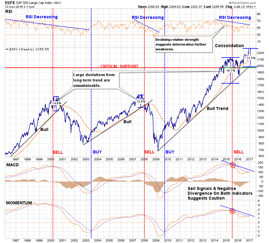
In the near term, as we head into holiday-shortened trading weeks, performance chasing and end of year “window dressing”, a push higher is extremely likely. However, given the underlying detachment between “sentiment” and “reality,” the risk of a negative surprise has risen sharply.
As Bob Farrell’s rule #9 states:
“When all experts and forecasts agree, something else is bound to happen.”
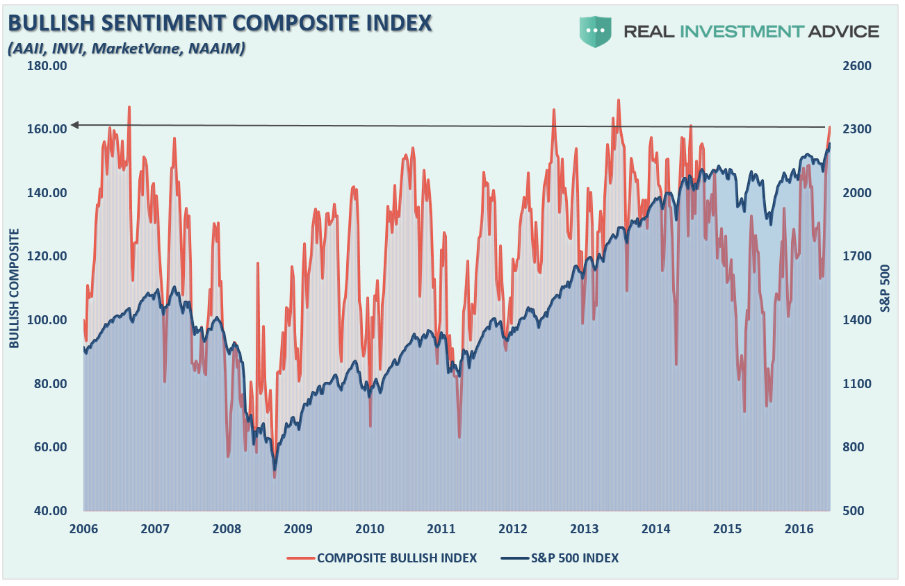
Currently, everyone agrees:
Furthermore, Spencer Jakeb made a very good point about Dow 20,000 in his latest WallStreet journal piece.
“Yale professor Robert Shiller’s cyclically adjusted price/earnings ratio now stands above 28 based on a decade of inflation-adjusted earnings for the S&P 500 stock index, which tracks the Dow closely.
That puts stocks within the most expensive 5% of all observations in 135 years.
At some Dow milestones that took years to break through decisively—100, 200, 1000 and 10000—valuation also has been elevated at an average of 24 compared with a little less than 13 when the market finally left those marks behind.”
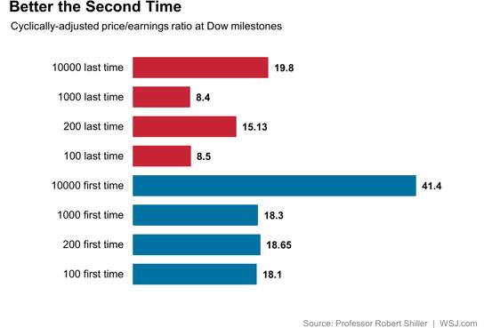
“At the long-run rate of inflation-adjusted earnings growth, it would take about 14 years for the Shiller P/E to fall below 20 at current stock prices. That would be par for the course as it took an average of 15 years for Dow 100, 1000 and 10000 to be visited for the first and last times.
Past isn’t prologue, but keep those Dow 20000 hats around—they may come back into fashion around the year 2030.”
As shown above, the “Trump Trade” has become extremely crowded on expectations about what “might” occur rather than what has. However, much like we saw in 1999, investors piled into stocks with expectations the market advance would never end.
They were horribly wrong.
Fed’s Fantasy Vs. Reality
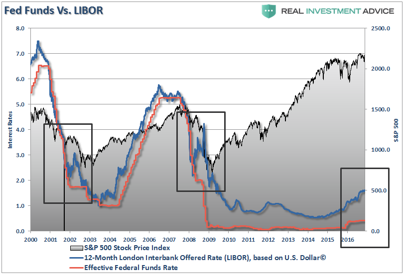
This past week, Janet Yellen and the Federal Reserve finally did something they have been promising to do for an entire year – raise interest rates.
Mind you, the lift in interest rates from .50% to .75% has hardly moved the Effective Federal Funds Rate BUT the London Interbank Offered Rate (LIBOR), which is what affects a variety of actual interest payments, has already risen sharply in recent months. In other words, the Fed is already well behind the actual market in terms of tightening monetary policy.
Here is Janet’s statement on the rate hike:
“The committee currently expects that, with gradual adjustments in the stance of monetary policy, economic activity will continue to expand at a moderate pace and labor market indicators will continue to strengthen.“
And with that, the Fed’s “Dot Plot” shows the Fed plans to hike rates three times during the next year moving the Fed Funds Rate to 1.5%.
Oh, wait a second, that was what she said in 2015.
Here is what she said this past week:
“Our decision to raise rates should certainly be understood as a reflection of the confidence we have in the progress the economy has made and our judgment that will continue.”
And once again, the Fed’s “Dot Plot” suggests the Fed hopes to hike rates three times within the next year.
The problem, and as I will dissect in a bit more detail, is the expanse between the Fed’s“fantasy” and economic realities. This is shown in the table below which documents the median of the Fed’s economic projections versus reality. In every single year, they have been wrong.

Yet, besides being the world’s worst economic forecasters, the market still believes statement she makes. Let’s analyze her comments and compare them to reality for a moment.
Employment
“Job gains, averaged nearly 180,000 per month over the past three months, maintaining the solid pace that we have seen since the beginning of the year. Over the past 7 years, since the depths of the great recession, more than 15 million jobs have been added to the U.S. economy. The unemployment rate fell to 4.6 percent in November, the lowest level since 2007, prior to the recession.”
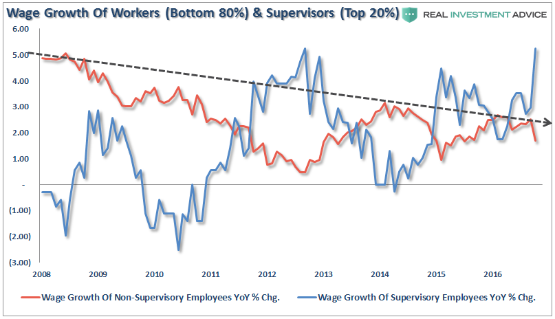
Depending on where you start counting, 15 million jobs may have been added to the U.S. economy. However, there is an important distinction to be made. As shown below, the actual number of jobs created is 4.77 million fewer than the increase in the working-age population. (June 2009 to Present).

This explains why, outside of mandated minimum wage and supervisory employee salary increases, wages and economic growth have remained exceptionally weak.
And inflation-adjusted hourly wages are also headed back to zero growth which hardly suggests economic acceleration.

Even the Fed’s own Labor Market Conditions Index (LMCI) suggests that something isn’t quite right in the economy as its 12-month moving average has now dipped below zero for an entire quarter. As I noted Thursday, she is right about one thing:
- YELLEN: LABOR MKT LOOKS LIKE IT DID BEFORE RECESSION
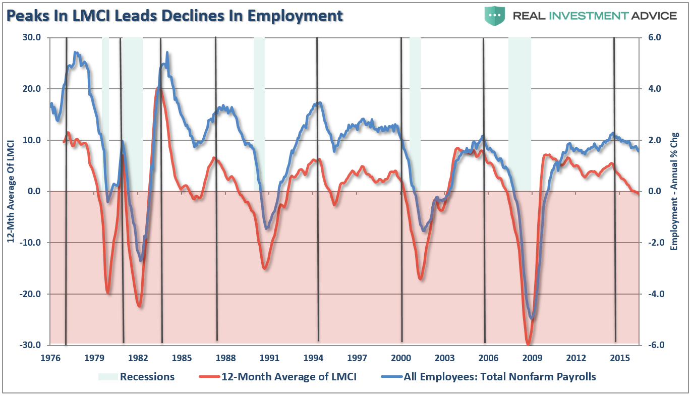
“Historically speaking, peaks in the 12-month average of the LMCI index have been coincident with declines in employment and the onset of weaker economic growth.
While the Fed raised it’s longer term interest rate forecast, and projected three more hikes to the Fed Funds Rate in 2017, there is a strong probability this is the same wishful thinking they have had over the last two years.
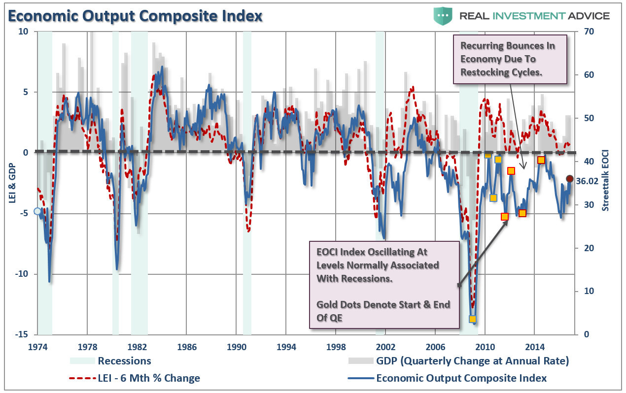
As shown in all the data above and the EOCI index below (a broad composite of manufacturing, service and leading indicators), the current economic bounce is likely another in a series of temporary restocking cycles. These cycles have been repeatedly witnessed after cyclical slowdowns in economic growth. Furthermore, as shown below, with the broader economy operating at levels more normally associated with recessions than expansions, there is little suggesting an ability to support substantially higher rates or generate inflationary pressures above 2%.”
Inflation
“Core inflation which excludes energy and food prices that tend to be more volatile than other prices, has risen to one and three-quarters percent. As the transitory influences of earlier declines in energy prices and prices of imports continue to fade, and as the job market strengthens further we expect overall inflation to rise to 2 percent over the next couple of years.”
Here is the problem.
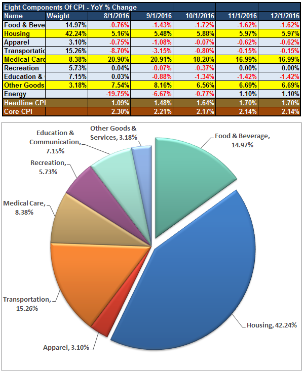
The only inflation in the market currently is coming from spiking health care costs and rental rates as shown in the breakdown of the Consumer Price Index. It is clear where inflationary pressures have come from over the last 5-months.
Inflation can be both good and bad. Inflationary pressures can be representative of expanding economic strength if it is reflected in stronger pricing of both imports and exports. Such increases in prices would suggest stronger consumptive demand, which is two thirds of economic growth, and increases in wages allowing for absorption of higher prices. That would be the good.
The bad would be inflationary pressures in areas which are direct expenses to the household. Such increases curtail consumptive demand, which negatively impacts pricing pressure, by diverting consumer cash flows into non-productive goods or services.
If we take a look at import and export prices there is little indication that inflationary pressures are present.
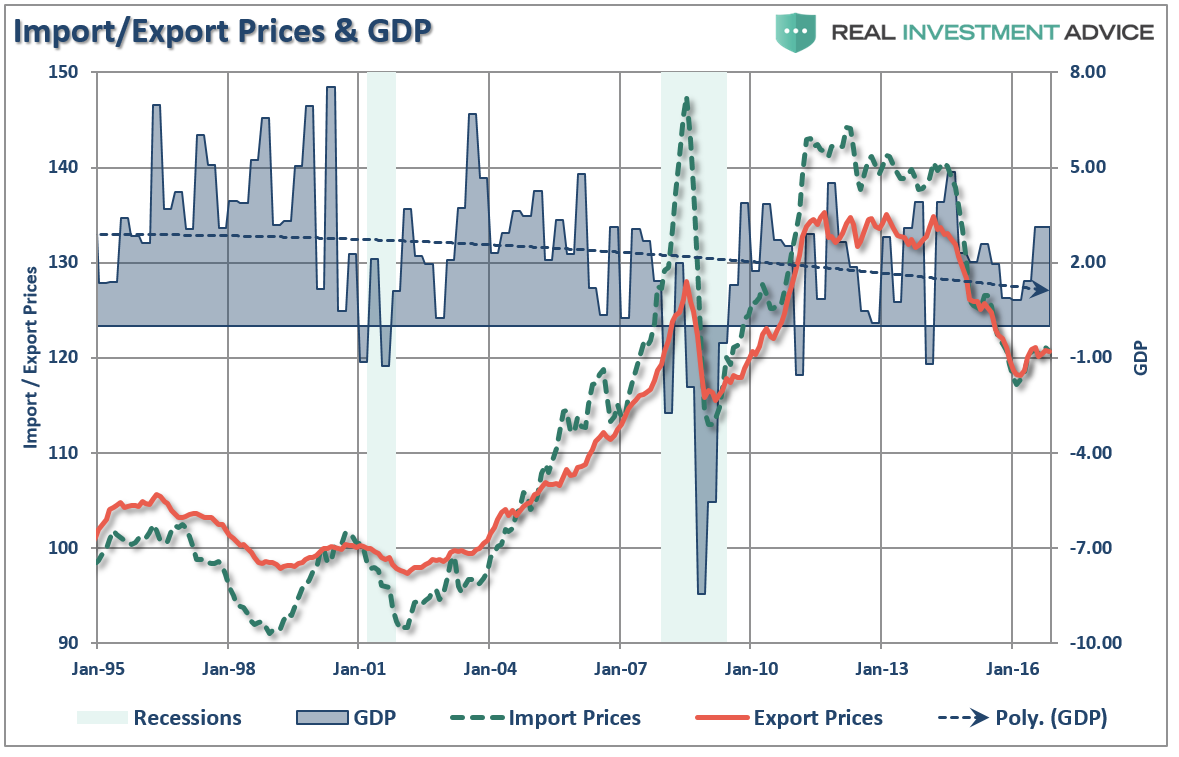
In fact, there are more deflationary forces in the economy currently than inflationary. Furthermore, with Housing and Medical Care extracting dollars from consumers into areas that do not boost economic growth, expectations of higher “good inflation” that leads to stronger employment, wage and economic growth are likely misplaced.
Economic Growth
“The median projection for growth of inflation-adjusted gross domestic product rises from 1.9 percent this year to 2.1 percent in 2017, and stays close to 2 percent in 2018 and 2019, slightly above its estimated longer run rate.”
Unfortunately, she will likely be proved wrong once again as she has been in every year since 2011 as “hope” is eventually faced with economic realities.
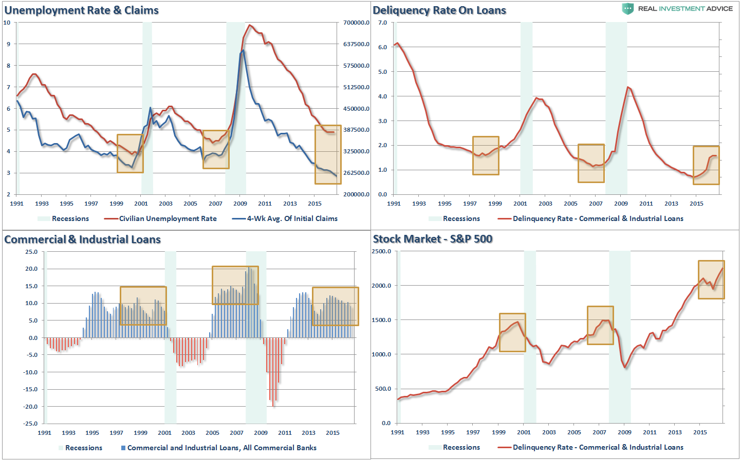
First, “record levels” of anything are records for a reason. It is where the point where previous limits were reached. Therefore, when a “record level” is reached it is NOT THE BEGINNING, but rather an indication of the MATURITY of a cycle. While the media has focused on employment, record stock market levels, etc. as a sign of an ongoing economic recovery, history suggests caution. The 4-panel chart below suggests that current levels should be a sign of caution rather than exuberance.
Paul Kasriel summed the problem up as well:
“Notice the green line in Chart 1. It represents the year-over-year percent change in quarterly-average observations of the sum of commercial bank credit (loans and securities on the books of commercial banks) and the monetary base (reserves held at the Fed by depository institutions and currency in circulation). As regular readers (are there still two of you?) of this commentary remember, this sum is what I refer to as thin-air credit because it is credit that is created by the commercial banking system and the Fed figuratively out of thin air. The unique characteristic of thin-air credit is that no one else need cut back on his/her current spending as the recipient of this credit increases his/her current spending. Notice that growth in this measure of thin-air credit, as represented by the green line in Chart 1, has been trending lower since hitting a post-recession peak in the fourth quarter of 2014.”
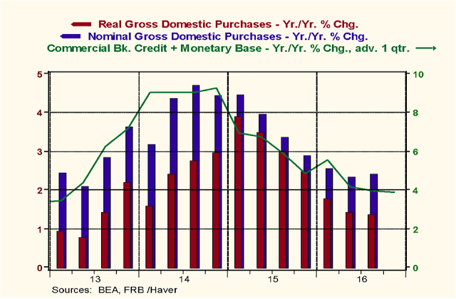
“Based on published data so far for Q4:2016, the Atlanta Fed is forecasting real GDP annualized growth in this current quarter of 2.4%, down from the previous quarter’s 3.2% annualized growth. With current growth in thin-air credit already very weak and likely to get even weaker after the Fed contracts the monetary base more in order to push the federal funds rate 25 basis points higher, real and nominal U.S. economic growth is likely to slow further in the first half of 2017.”
So, if you are betting on a strong economic recovery to support excessive valuations and extremely stretched markets, you could be setting yourself up for disappointment.
Oh, and don’t think for a moment that rising interest rates, combined with a strongly rising dollar, is somehow “good for stocks.”
It isn’t.
It has never been.
Hedging portfolio risk remains prudent.
#PortfolioHedgesMatter
Market & Sector Analysis
Data Analysis Of The Market & Sectors For Traders
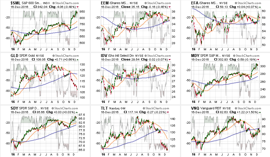
S&P 500 Tear Sheet
Thank you for your recent suggestions, while not all requests are possible to fulfill due to data limitations, I do appreciate the input.
Update: As requested, I have added price momentum analysis for S&P 500, 400, & 600 indices.
If you have any suggestions or additions you would like to see, send me an email.
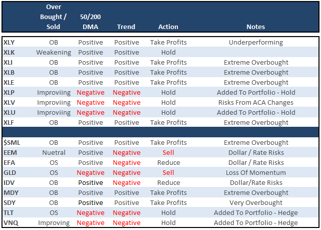
Sector Analysis
Comments
The market struggled last week plunging 1.46 points to finish the week down .06% after the Fed announced a rate hike for the first time in 2016. (#sarcasm alert). Financials continued to lead the charge the last week, and remain extremely overbought. Profit taking remains highly recommended. Small and Mid-cap stocks, Energy, Materials, and Industrials outperformed the index as well. The problem, as stated above, is that a stronger dollar and higher interest rates will likely hamper this optimism sooner rather than later. This is particularly the case with Small and Mid-Cap companies that are the most susceptible to monetary tightening.
(Note: I have changed the sector and major market analysis charts to a 50/200 DMA crossover signal and embedded an overbought/sold indicator.)
The table below shows thoughts on specific actions related to the current market environment. (These are not recommendations, just ideas related to market extremes and contrarian positioning within portfolios. Use at your own risk and peril.)
Over the last couple of weeks, as suggested, we have continued to hedge our long-equity positions with deeply out-of-favor sectors of the market (Bonds, REIT’s, Staples, Utilities) which paid off well during the volatility last week.
The table below shows the relative performance of each sector as compared to the S&P 500 over a 1, 4, 12, 24 and 52-week basis. Historically speaking, sectors that are leading the markets higher continue to do so in the short-term and vice-versa. The relative improvement or weakness of each sector relative to index over time can show where money is flowing into and out of. Normally, these performance changes signal a change that lasts several weeks.
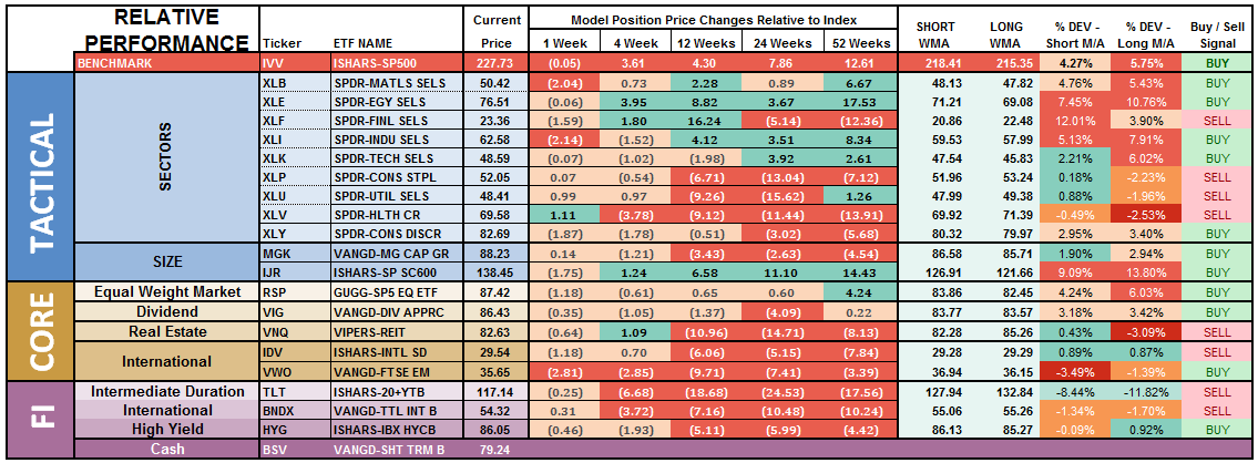
(Note: The buy/sell signal at the far right is a binary result based on the crossover of the short and long-term moving averages and is not a specific recommendation.)
The numbers of sectors on SELL signals is INCREASING despite the market melt-up suggesting a much narrower overall advance than major indices would suggest. This is typical of a late-stage melt-up rally so caution is advised.
As I have been warning over the last couple of months, the stronger dollar is, and will continue, to negatively impact emerging markets. Materials and Industrials are also losing momentum and should be pared back or hedged.
We are seeing a relative performance pickup in Bonds, Utilities, REIT’s, Staples and Healthcare.
Gold is on an all-out sell signal and should remain out of portfolios for now entirely.
Materials, Financials, Industrials, and Energy are pushing range extremes.
Everything is currently pointing to this being a very late stage advance, so profit taking, hedging, and rebalancing is strongly advised.
THE REAL 401k PLAN MANAGER
The Real 401k Plan Manager – A Conservative Strategy For Long-Term Investors
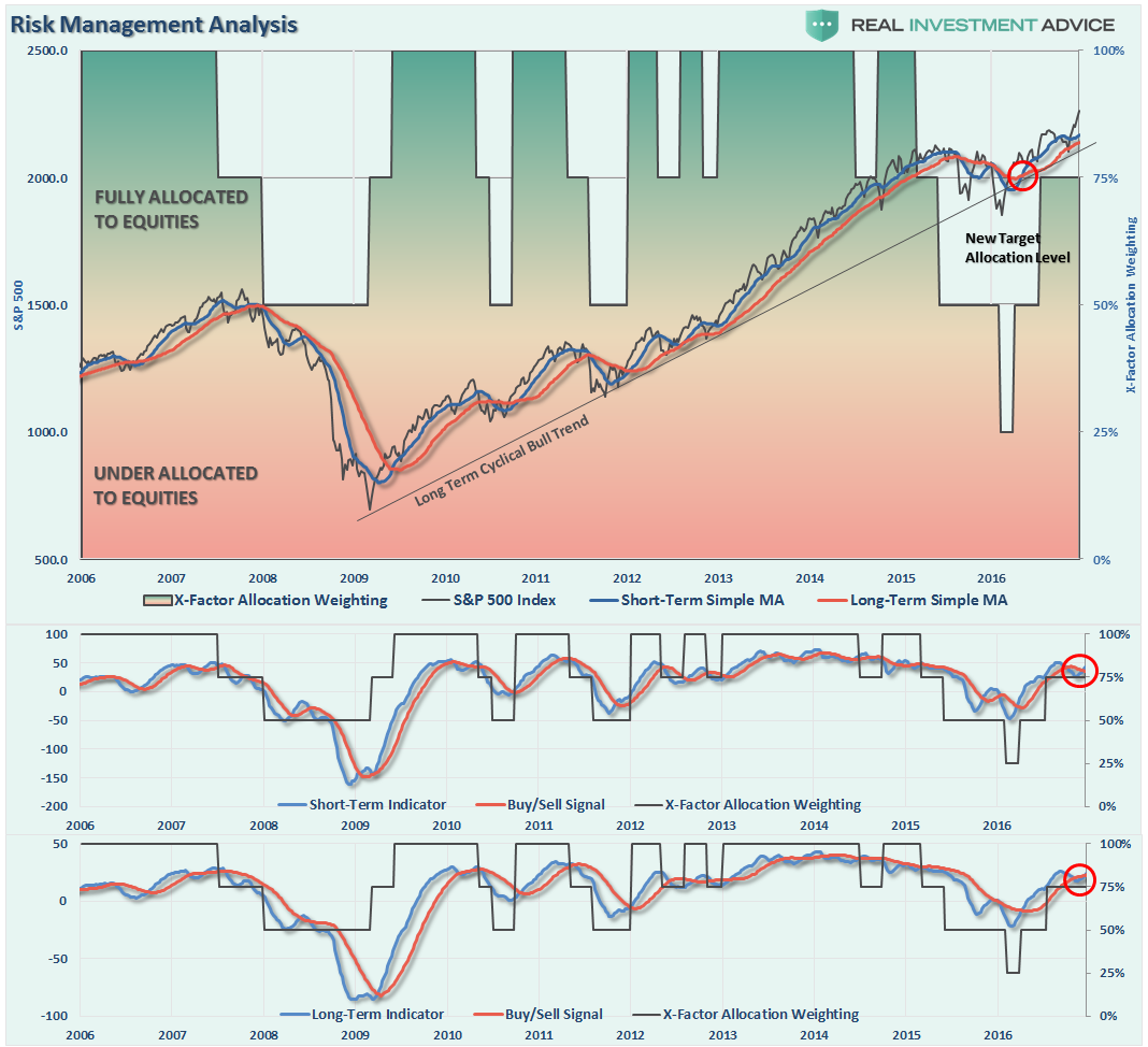
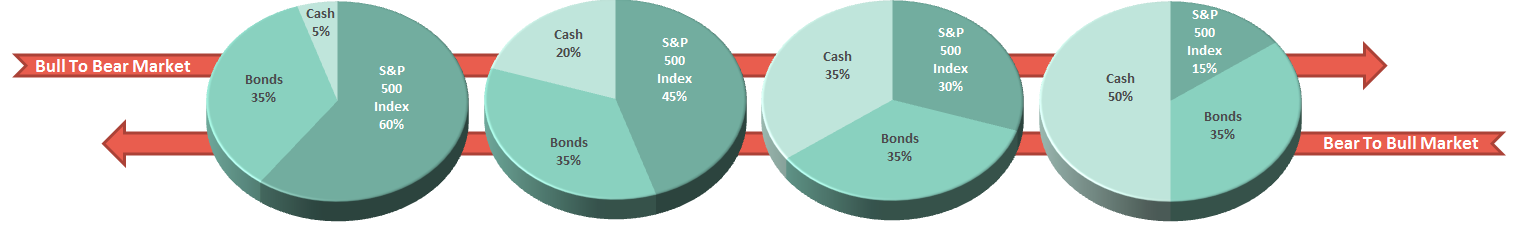
There are 4-steps to allocation changes based on 25% reduction increments. As noted in the chart above a 100% allocation level is equal to 60% stocks. I never advocate being 100% out of the market as it is far too difficult to reverse course when the market changes from a negative to a positive trend. Emotions keep us from taking the correct action.
Riding With Santa
With the last two holiday-shortened trading weeks just ahead, portfolio and hedge fund managers will likely continue to chase performance and “window dress” portfolios into the end of the year.
However, come the first quarter of the year, the risk of a correction to some degree is highly likely to reverse the extreme overbought condition of the market. Therefore, as I penned in last week’s missive, I continue to suggest using the current rally to clean up portfolios as detailed previously.
Step 1) Clean Up Your Portfolio
- Tighten up stop-loss levels to current support levels for each position.
- Hedge portfolios against major market declines.
- Take profits in positions that have been big winners
- Sell laggards and losers
- Raise cash and rebalance portfolios to target weightings.
Step 2) Compare Your Portfolio Allocation To The Model Allocation.
- Determine areas requiring new or increased exposure.
- Determine how many shares need to be purchased to fill allocation requirements.
- Determine cash requirements to make purchases.
- Re-examine portfolio to rebalance and raise sufficient cash for requirements.
- Determine entry price levels for each new position.
- Determine “stop loss” levels for each position.
- Determine “sell/profit taking” levels for each position.
(Note: the primary rule of investing that should NEVER be broken is: “Never invest money without knowing where you are going to sell if you are wrong, and if you are right.”)
Step 3) Have positions ready to execute accordingly given the proper market set up. In this case, we are looking for a correction to reduce the overbought condition of the market to allow for a better opportunity to rebalance equity risk.
The big risk in the near-term is when the markets come to grips with the rise in rates, simultaneously with a stronger dollar, which will quickly erode earnings in an already over-valued market. With the Fed rate hike last week, the further tightening of monetary policy, against an already weak economic backdrop, suggests an elevated risk of correction.
If you need help after reading the alert; don’t hesitate to contact me.
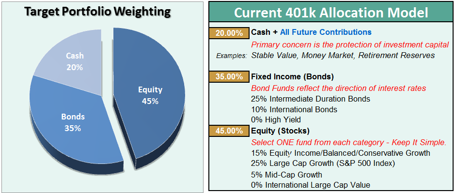
Current 401-k Allocation Model
The 401k plan allocation plan below follows the K.I.S.S. principal. By keeping the allocation extremely simplified it allows for better control of the allocation and a closer tracking to the benchmark objective over time. (If you want to make it more complicated you can, however, statistics show that simply adding more funds does not increase performance to any great degree.)
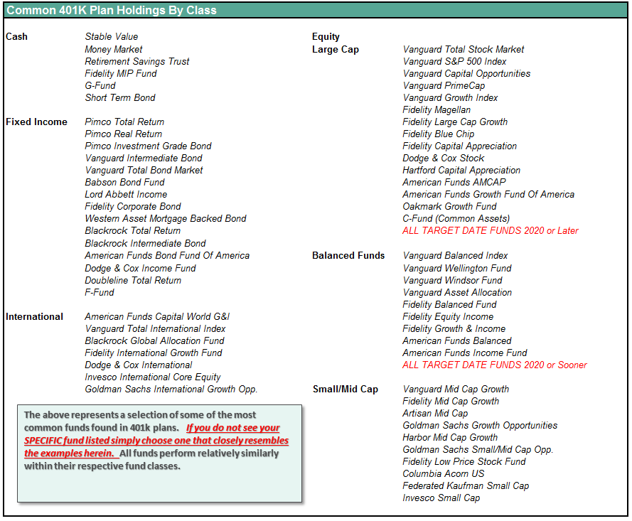
401k Choice Matching List
The list below shows sample 401k plan funds for each major category. In reality, the majority of funds all track their indices fairly closely. Therefore, if you don’t see your exact fund listed, look for a fund that is similar in nature.
Disclosure: The information contained in this article should not be construed as financial or investment advice on any subject matter. Streettalk Advisors, LLC expressly disclaims all liability in ...
more


Great charts and good assumptions, however, it usually takes 6 months before the effects of a new President is felt putting the recent rise firmly in the current market as it is. It is a bit much to make any major speculations besides the direction of the Federal Reserve.
I agree that raising rates at the end of a cycle is dangerous. This alone should make people worry which is why people are rushing into the stock market and out of bonds. Sadly, few stocks actually usually benefit from higher rates initially and only do later if the economy expands substantially more than interest rates and inflation rise.
Once again, we will see what happens. If Trump engages in even greater Democratic style deficit spending we may see inflation spike with economic growth failing to keep up, especially if a trade war erupts. If trump can stimulate small business which is the backbone of a strong economy we can see a real revival of our economic growth despite the long cycle.
This said, it's best to bide your time and wait patiently while getting out of super interest rate sensitive investments that decline on rising rates and investing in what potentially can grow if the economy is revitalized by a set of business friendly changes in government.
Thanks for sharing