
RIA Chart Book: Q4-2017's Most Important Charts

In Q3 of last year, Michael Lebowitz and I decided that each quarter we would produce a “chartbook” of the “most important charts” from the last quarter for you to review. In addition to the graphs, we provide a short excerpt from the article as well as the links to the original articles for further clarification and context if needed.
The Federal Reserve Reveals The Ugly Truth
The 2016 survey confirms statements I have made previously regarding the Fed’s monetary interventions leaving the majority of Americans behind:
“However, setting aside that point for the moment, how valid is the argument the rise of asset prices is related to economic strength.
Since companies ultimately derive their revenue from consumers buying their goods, products, and services, it is logical that throughout history stock price appreciation, over the long-term, has roughly equated to economic growth. However, unlike economic growth, asset prices are psychologically driven which leads to “boom and busts” over time. Looking at the current economic backdrop as compared to asset prices we find a very large disconnect.
Since Jan 1st of 2009, through the end of June, the stock market has risen by an astounding 130.51%. However, if we measure from the March 9, 2009 lows, the percentage gain explodes to more than 200%.
With such a large gain in the financial markets we should see a commensurate indication of economic growth – right?”

“The reality is that after 3-massive and unprecedented Federal Reserve driven “Quantitative Easing” programs, a maturity extension program, bailouts of TARP, TGLP, TGLF, etc., HAMP, HARP, direct bailouts of Bear Stearns, AIG, GM, bank supports, etc., all of which total more than $33 Trillion, the economy grew by just $2.64 Trillion, or a whopping 16.7% since the beginning of 2009. The ROI equates to $12.50 of interventions for every $1 of economic growth.”
Read: Fed Study: The Bottom 90% And The Failure Of Prosperity
Risk vs. Reward
There are two divergent facts that make investing in today’s market extremely difficult.
- The market trend by every measure is clearly bullish. Any novice technician with a ruler projected at 45 degrees can see the trend and extrapolate ad infinitum.
- Markets are extremely overvalued. Intellectually honest market analysts know that returns produced in valuation circumstances like those observed today have always been short-lived when the inevitable correction finally arrives.
In The Deck is Stacked we presented a graph that showed expected five-year average returns and the maximum drawdowns corresponding with varying levels of Cyclically-Adjusted Price-to-Earnings (CAPE) ratios since 1958. We alter the aforementioned graph, as shown below, to incorporate the odds of a 20% drawdown occurring within the next five years.

Over the next five years we should expect the following:
- Annualized returns of -.34% (green line)
- A drawdown of 27.10% from current levels (red line)
- 76% odds of a 20% or greater correction (yellow bars)
Read: Protecting Your Blind Side
Tax Cut Impact
So, with 80% of Americans living paycheck-to-paycheck, the need to supplant debt to maintain the standard of living has led to interest payments consuming a bulk of actual disposable income. The chart below shows that debt has exceeded personal consumption expenditures. Therefore, any tax relief will most likely evaporate into the maintaining the current cost of living and debt service which will have an extremely limited, if any, impact on fostering a higher level of consumption in the economy.
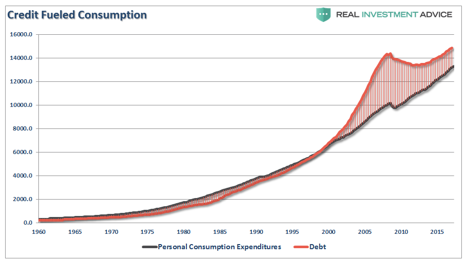
Read: Bull Trap – The False Promise Of Tax Cuts
One Chart
Our chart of the day is a long-term view of price measures of the market. The S&P 500 is derived from Dr. Robert Shiller’s inflation adjusted price data and is plotted on a QUARTERLY basis. From that quarterly data I have calculated:
- The 12-period (3-year) Relative Strength Index (RSI),
- Bollinger Bands (2 and 3 standard deviations of the 3-year average),
- CAPE Ratio, and;
- The percentage deviation above and below the 3-year moving average.
- The vertical RED lines denote points where all measures have aligned
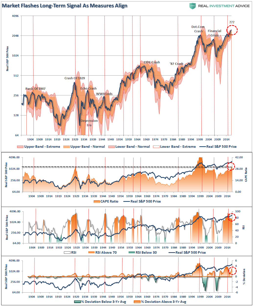
Read: One Chart Show Why Investors Are Dealt A Losing Hand
Borrowing From The Future
The stock market has returned more than 60% since 2007 peak, which is more than three times the growth in corporate sales growth and 30% more than GDP. The all-time highs in the stock market have been driven by the $4.5 trillion increase in the Fed’s balance sheet, hundreds of billions in stock buybacks, PE expansion, and ZIRP.
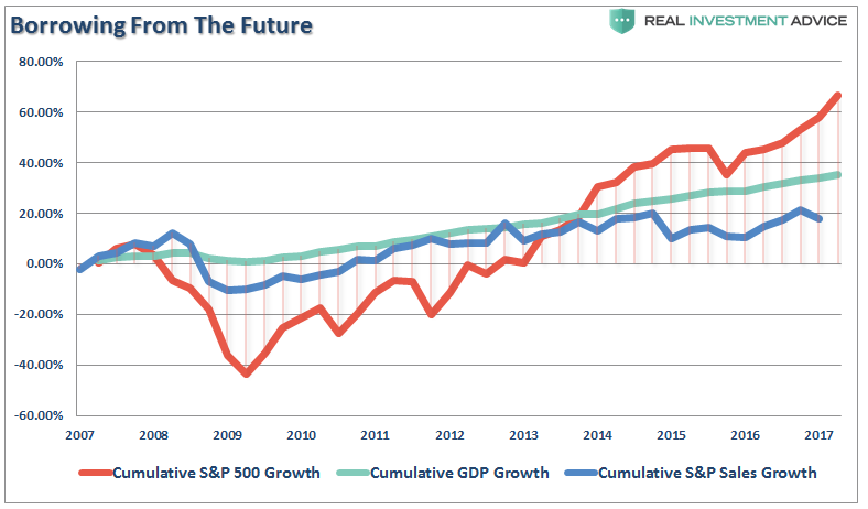
It is critical to remember the stock market is NOT the economy. The stock market should be reflective of underlying economic growth which drives actual revenue growth. Furthermore, GDP growth and stock returns are not highly correlated. In fact, some analysis suggests that they are negatively correlated and perhaps fairly strongly so (-0.40).
However, in the meantime, the promise of a continued bull market is very enticing as the “fear of missing out” overrides the “fear of loss.”
Read: Bogle, Buffett, Shiller, Tobin – Valuations Are Expensive
Markets Don’t Compound
Morgan Stanley states that in 30 years if the Dow grows at just 5% annually, it will hit 500,000. However, if the Dow actually compounded returns at 5%, in the future, as Morgan suggests, it would have done so in the past and would ALREADY be at 500,000.
But it’s not. We are just stuck here at ole’ 23,000.

There is a huge difference between compound returns and average returns. The historical return of the markets since 1900, including dividends, has averaged a much higher rate of return than just 5% annually. Therefore, the Dow should actually be much closer to 1,000,000 than just 500,000.
Read: Dow 500,000? We Are Already There
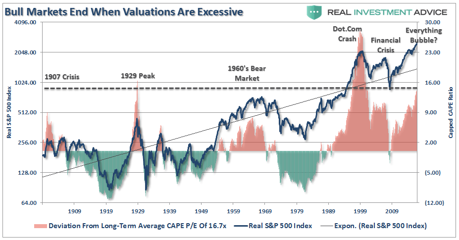
Not In A New Secular Bull Market
However, as noted above, and as shown below, “secular bull markets,” which are long-term growth trends, have never started from 15x valuations and immediately surged to the second highest level on record. Historically, as shown below, secular bull markets are born of excessive pessimism and low valuations that stay in place for years as earnings and profitability grow faster than prices (keeping valuations lower.) Despite Mr. Saut’s hopes, that is simply not the case today as valuations exploded as earnings, economic and profit growth lagged the liquidity induced surge in asset prices.
Read: Fundamentally Speaking – Markets Being Driven By Fundamentals?
The Myths Of Tax Cuts
Myth #1: Tax Cuts Will Create An Economic Revival
As the Committee for a Responsible Federal Budget stated last week:
“Tax cuts do not pay for themselves; they can create growth, but in the amount of tenths of percentage points, not whole percentage points. And they certainly cannot fill in trillions in lost revenue. Relying on growth projections that no independent forecaster says will happen isn’t the way to do tax reform.”
That is absolutely correct and as I pointed out on Friday:
“As the chart below shows there is ZERO evidence that tax cuts lead to stronger sustained rates of economic growth. The chart compares the highest tax rate levels to 5-year average GDP growth. Since Reagan passed tax reform, average economic growth rates have only gone in one direction.”
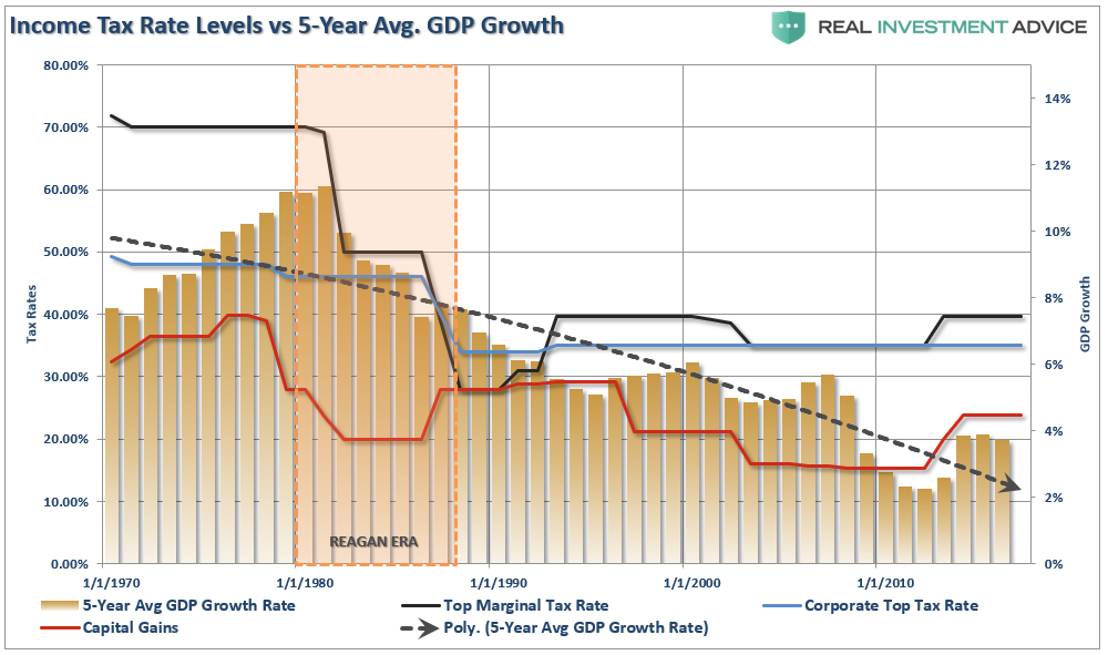
Read: The 3-Myths Of Tax Cuts
What does 2028 hold in store?
The following graph and table explore the range of outcomes that are possible given the scenarios outlined above. To help put context around the wide range of expected returns, we calculated an equity-equivalent price of the 10-year U.S. Treasury Note and added it to the graph as a black dotted line. Investors can use the line to weigh the risk and rewards of the S&P 500 versus the option to purchase a relatively risk-free U.S. Treasury Note. The table below the graph serves as a legend and reveals more information about the forecasts. The color shading on the table affords a sense of whether the respective scenario will produce a positive or negative return as compared to the U.S. Treasury Note. The far right column on the table indicates the percentage of observations since 1881 that CAPE has been higher than the respective scenarios.
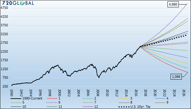
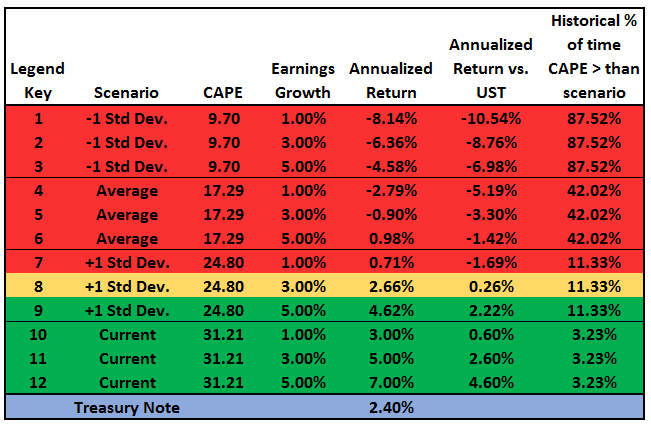
Data Courtesy: Robert Shiller and 720Global/Real Investment Advice
Read: Three Easy Pieces
Why Rates Can’t Rise
The chart below shows only the composite index and the 10-year Treasury rate. Not surprisingly, the recent decline in the composite index also coincides with a decline in interest rates.
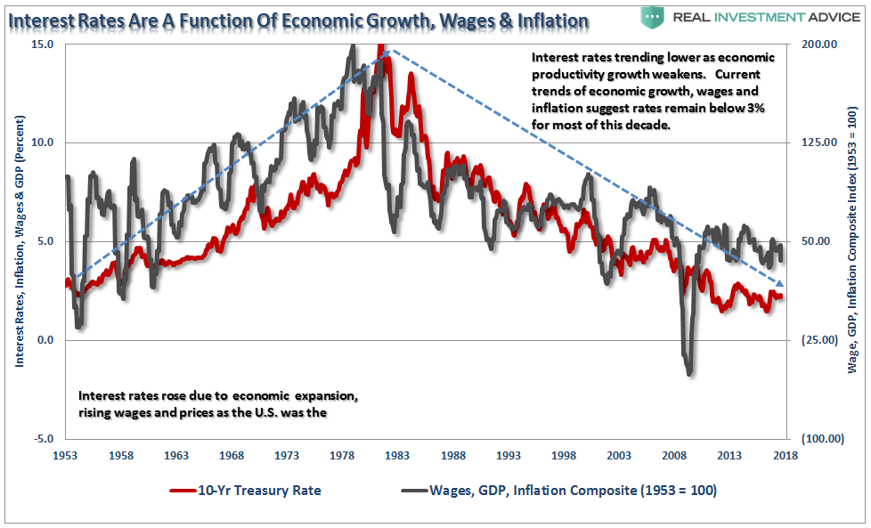
In the current economic environment, the need for capital remains low, outside of what is needed to absorb incremental demand increases caused by population growth, as demand remains weak. While employment has increased since the recessionary lows, much of that increase has been the absorption of increased population levels.
Read: Bond Bears & Why Rates Won’t Rise
On Punditry
So sorry, Suze. This bit of knowledge? Strikeout. Not everything compounds.
“Orman explained that if a 25-year-old puts $100 into a Roth IRA each month, they could have $1 million by retirement.”
This statement perplexes me. While I wholeheartedly agree with a monthly investing or saving discipline spouted here, especially into a Roth IRA where earnings grow tax-deferred and withdrawn tax-free at retirement, I had a dilemma making her retirement numbers work.

As outlined in the chart above, on an inflation-adjusted basis, achieving a million-buck balance in 40 years by dollar-cost averaging $100 a month, requires a surreal 11.25% annual return. In the real world (not the superstar pundit realm), a blind follower of Suze’s advice would experience a whopping retirement funding gap of $695,254.68.
I don’t know about you, to me, this is a Grand Canyon expectation vs. reality-sized unwelcomed surprise.
Read: Fabrications Of Financial Media Superstars
The Myth Of Buy & Hold
Once you set aside the daily media chatter, sales pitches, poor investment advice and investing methods that have a complete lack of evidence to support them, you find out one simple truth:
“Managing the risk of drawdowns is what separates having enough money to live out your retirement dreams, or not.”
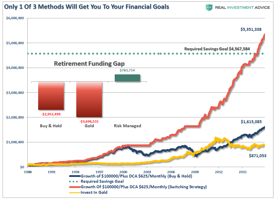
With this in mind, the reality of saving for your retirement should be clear as 2 of the 3 methods discussed above leave you well short of your financial goals.
Read: 2-Of-3 Investing Methods Will Leave You Short
Global QE
Global central banks’ post-financial crisis monetary policies have collectively been more aggressive than anything witnessed in modern financial history. Over the last ten years, the six largest central banks have printed unprecedented amounts of money to purchase approximately $14 trillion of financial assets as shown below. Before the financial crisis of 2008, the only central bank printing money of any consequence was the Peoples Bank of China (PBoC).
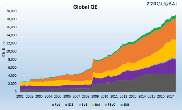
The central banks’ goals, in general, are threefold:
- Expand the money supply allowing for the further proliferation of debt, which has sadly become the lifeline of most developed economies.
- Drive financial asset prices higher to create a wealth effect. This myth is premised on the belief that higher financial asset prices result in greater economic growth as wealth is spread to the masses.
- “And higher stock prices will boost consumer wealth and help increase confidence, which can also spur spending. Increased spending will lead to higher incomes and profits that, in a virtuous circle, will further support economic expansion.”– Ben Bernanke Editorial Washington Post 11/4/2010.
- Lastly, generate inflation, to help lessen the burden of debt.
Read: A Question For Every Investor
Turning Japanese
More importantly, while there are many calling for an end of the “Great Bond Bull Market,” this is unlikely the case. As shown in the chart below, interest rates are relative globally. Rates can’t rise in one country while a majority of economies are pushing negative rates. As has been the case over the last 30-years, so goes Japan, so goes the U.S.

Unfortunately, for the Administration, the reality is that cutting taxes, and MORE debt, is unlikely to change the outcome in the U.S. The reason is that monetary interventions and government spending don’t create organic, and sustainable, economic growth. Simply pulling forward future consumption through monetary policy continues to leave an ever-growing void in the future that must be filled. Eventually, the void will be too great to fill.
Read: Tax Reform And The Japanification Of America
The Long End Of The Curve
Each time, when liquidity was extracted from the financial markets, the rotations from “risk” to “safety” pushed yields lower. Not higher. The chart below is the 8-rolling average of the Fed’s balance sheet which more clearly shows the correlation.
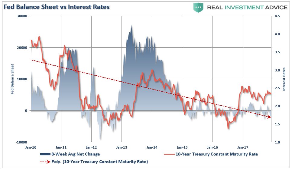
The correlation makes complete sense when you think about it. When the Fed is expanding their balance sheet, money flows into the equity markets driving “risk” assets higher. With the reduced need for “safety,” money rotates from bonds into stocks on an asset allocation basis. The opposite occurs when the Fed extracts liquidity from the markets.
Read: Can The Fed Really Boost Bond Yields
These are some of our favorite charts and we hope you find them useful and insightful.
Disclosure: The information contained in this article should not be construed as financial or investment advice on any subject matter. Streettalk Advisors, LLC expressly disclaims all liability in ...
more

