
Friday Sentiment
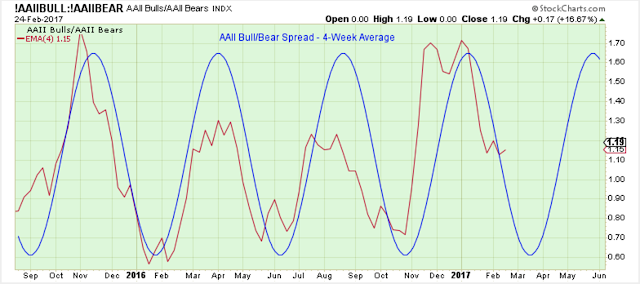
The 4-week average AAII bull/bear spread seems to be on schedule for a March low, but I am not sure the stock market is on the same schedule.
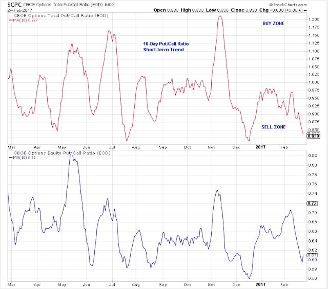
The 10-day put/call ratio is in the sell range.
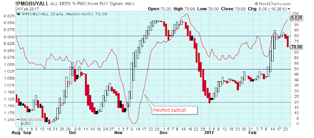
This chart shows the inverted 10-day put/call ratio (so it is now the 10-day call/put ratio) overlay with the general market PMO index. It looks like a reasonable way to help determine short-term highs and lows, and at the moment supports the view that a short-term peak is developing.
The Short-Term Trend
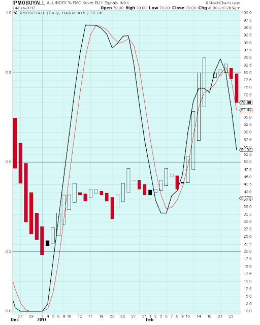
Here is a look at the PMO index with a stochastics overlay. From the looks of this, I believe we are close to a short-term top.
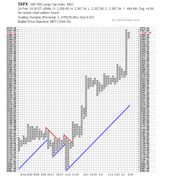
This chart shows the SPX stalling a bit after a solid run higher.
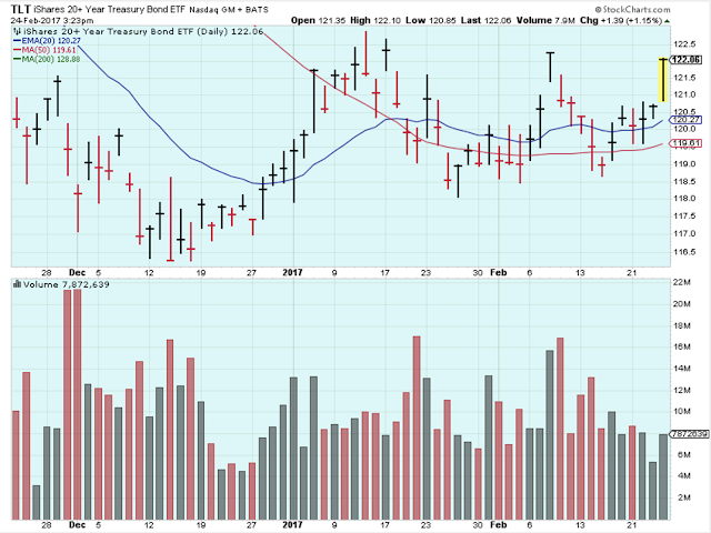
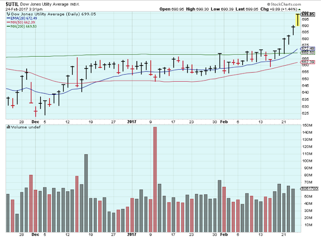
Investors have been getting defensive for a couple weeks, but today it accelerated as seen by the strength in Utilities, Treasuries, Staples, etc.
Here is a look at Utilities.
Sectors
This is such an interesting chart. It shows the XLF:XLU ratio in the top panel, and the 30Y Treasury yield in the bottom panel. I think I got this chart from John Murphy at stockcharts.com.
It shows that the influences that drive yields up and down have almost the same impact on financials and utilities.
The only problem is that I am not exactly sure how to use this chart to my advantage.

Follow Up
The long-term outlook is positive.
The medium-term trend is up.
The short-term trend is up.
Let me know your thoughts by leaving a comment.
Disclaimer: I am not a registered investment advisor. My comments above reflect my view of the market, ...
more


Thanks for sharing