
Economic Data Derails The Breakout
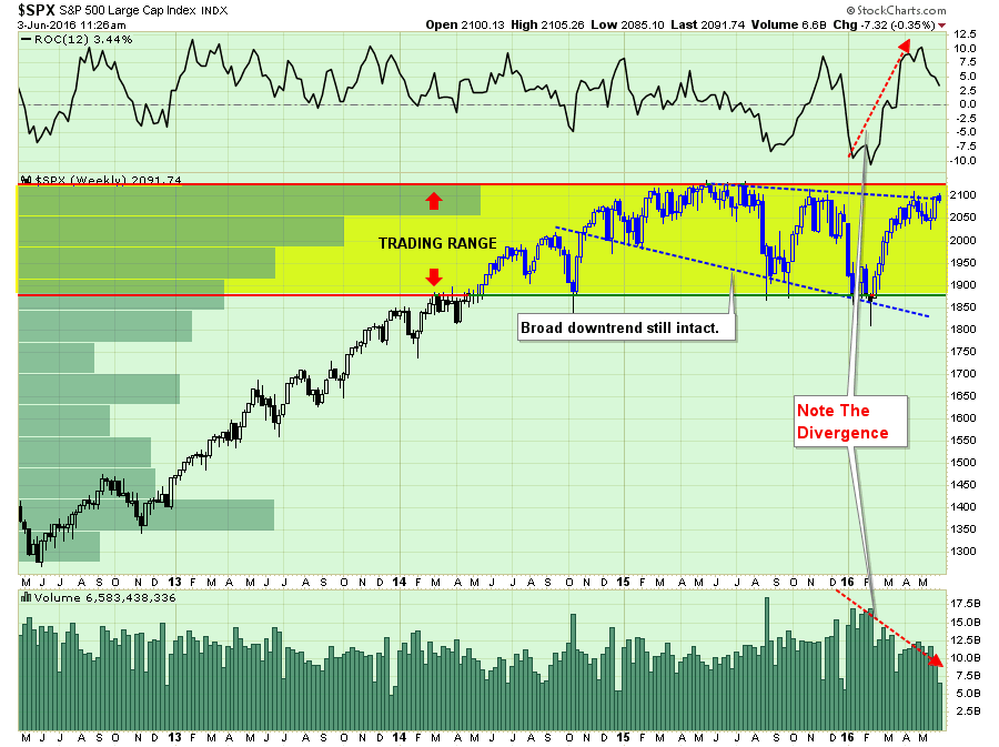
On Thursday, the market briefly peaked above 2100 giving the “bulls” a glimpse at all time highs. As I penned on Friday:
“The good news is that this sideways pattern of market action over the last year will come to an end and likely very soon.
The only question investors have to get right is whether that resolution will be a continuation of the bull market that began in 2009 OR will it be the beginning of a more protracted bear market decline.
“Step right up and place your bets.”
I have updated the analysis from last week which shows that while the market did bounce during the holiday-shortened trading week, it did so on very light volume. However, the more encouraging news is that on Thursday the market DID break above the downtrend that began last May.
However, since this is weekly analysis, that breakout MUST HOLD through the end of trading today (Friday). A failure to do so would negate the breakout and keep the markets confined in the current downward trending pattern.”
Here is the interesting part.
While the short-term market dynamics are improving, it has been primarily based on “hopes” the Fed will NOT raise rates in July.
With the Labor Department’s job report on Friday showing that non-farm payrolls grew by just 38,000 in May, much less than expected, this should not have been a real surprise. Nor should the backward revision to March’s data from 160,000 to 123,000.
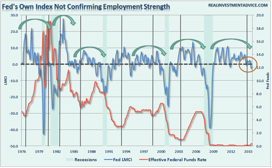
The weakness in hiring trends has been clearly evident in the Federal Reserve’s own Labor Market Conditions Index, which is supposed to be driving their policy decisions, over the last several months.
This decline in employment, combined with “global uncertainty” due to the potential exit from the Eurozone by Britain (Brexit), is being viewed as plenty of reason for the Federal Reserve to keep rate hikes on hold in July.
One additional point on the employment report. Despite all of the talk about a “tight labor market,” such is hardly the case given such a small percentage of the working age population actually working.
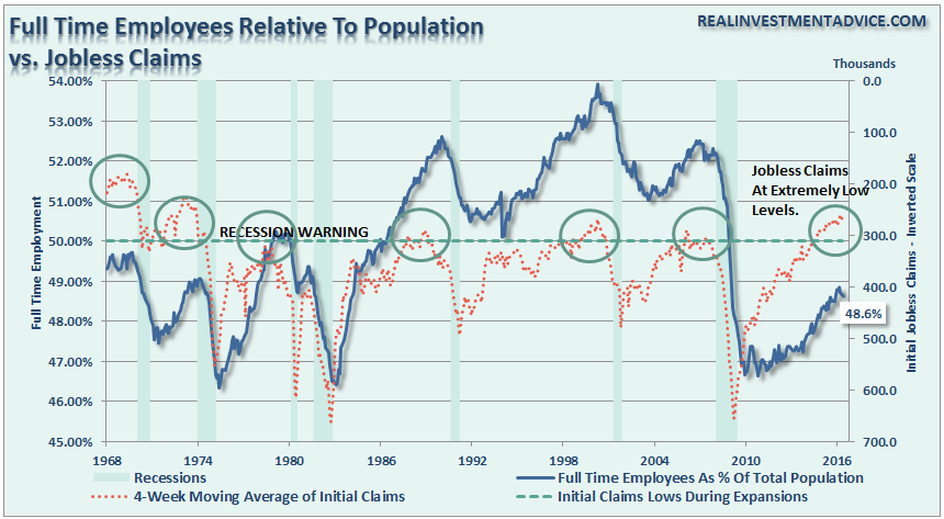
It is only “tight” because so many are no longer counted. When you have 1-in-5 families that have ZERO employed, that is hardly the case of a tight labor market.
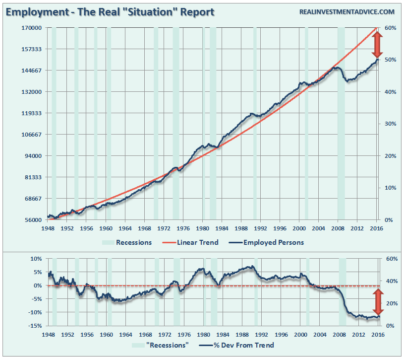
Furthermore, the deviation in employment for long-term trends also clearly indicate the demographic and structural shift in employment. The deviation from the trend is clear evidence of that shift which will continue to weigh on the long-term economic dynamics in the future.
Of course, it is NOT just the employment data keeping the Fed on hold.
As I addressed earlier this year, the “seasonal adjustment anomaly” due to the exceptionally warm winter was due to be reversed. As I stated:
“First, the manufacturing reports are ‘seasonally adjusted.’ These seasonal adjustments are designed to smooth the data over time to account for DECLINES in manufacturing activity during seasonally cold times of they year when inclement weather normally shutters in manufacturing activity.
However, given that the economy just experienced one of the most unseasonably WARM winters in 122 years, activity ran ahead of normal seasonal tendencies. When combined with the normal seasonal adjustments manufacturing data saw extremely sharp, and abnormal increases.
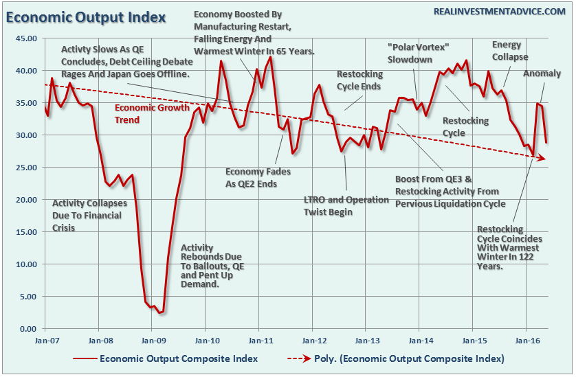
This is clearly seen in the chart below (updated) which is a composite economic output indicator which is comprised of the Fed Regional Manufacturing Surveys, Chicago Fed National Activity Index, Chicago PMI, ISM surveys, NFIB Survey and the Leading Economic Indicators.”
“Secondly, these bounces are simply normal restocking cycles as inventories are drawn down during protracted declines in activity. Furthermore, as with all economic data, nothing travels in a straight line either up or down.
However, in particular, the recent bounce in manufacturing data was a clear anomaly caused by the extremely warm winter weather. This could be seen in the recent slate of data points from the Fed Philadelphia Region as shown below:
- February: -2.8
- March: 12.4 (Anomaly)
- April: -1.6
- May: -1.8
The weakness in the manufacturing data will likely reassert itself as the seasonal cycle realigns with the seasonal adjustments.”
This realignment of the seasonal adjustments with reality is what we are witnessing now. As shown in the chart below, if we compare the Economic Output Cycle Index (EOCI) above to both GDP and the Leading Economic Indicator Index, we see a clearer picture of what is currently happening in the economy.
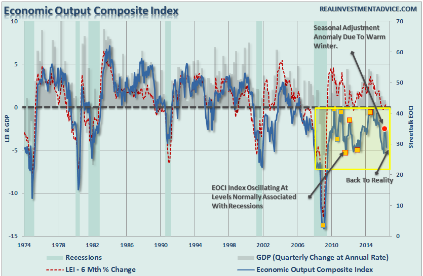
Not surprisingly, the EOCI has bottomed coincident with Central Bank interventions which drag forward future consumption. Unfortunately, when you “drag forward” future consumption today, you leave a “void”in the future that must be filled.
That future “void” continues to expand each time activity is dragged forward until, inevitably, it can not be filled. This is currently being witnessed in the overall data trends which are being reflected in the deterioration in corporate earnings and revenues.
While the media continues to “protest too much,” the reality is that earnings and revenue are a direct reflection of real economic activity.
The only question for investors is whether the ongoing delay of rate hikes by the Federal Reserve, and continued accommodative policy, can continue to support asset prices long enough for the economic cycle to catch up.
Historically, such is a feat that has never been accomplished.
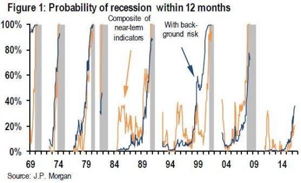
Recession indicators ticking up
Following the release of the employment data, and other rather dismal economic data, JP Morgan issued a note (courtesy of ZeroHedge) suggesting the probability of a recession beginning within 12 months has moved from 30% on May 5th, to 36% today. To wit:
“Our preferred macroeconomic indicator of the probability that a recession begins within 12 months has moved up from 30% on May 5 to 34% last week to 36% today (Table 1, bottom row and Figure 1, blue line). This marks the second consecutive week that the tracker has reached a new high for the expansion.”
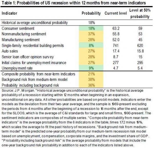
“With the rally in risk markets over the last month, our models based on financial market pricing now see a recession risk moderately below our model based on macroeconomic data (Table 2).”
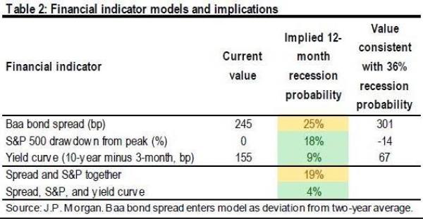
“Since last week, we have seen disappointments in the Dallas Fed measures of manufacturing and non-manufacturing sentiment, the ISM non-manufacturing index, and the Conference Board measure of consumer confidence. Of course, there was some positive news as well, with the manufacturing ISM and auto sales both showing slight improvements.
This morning’s employment report also raised the recession probabilities, although for counterintuitive reasons. We do not include the payrolls number in the recession model because it is subject to larger revisions than other labor market data. But the unemployment rate enters the model in two ways. As a near-term indicator, we watch for increases in the unemployment rate that occur near the beginning of recessions. So this morning’s move down in the unemployment rate lowered the recession probability in our near-term model. But we also find the level of the unemployment rate to be one of the most useful indicators of medium-term recession risk.So the move down in unemployment raises the model’s view of the risk of economic overheating in the medium run and raises the “background risk” of recession.”
I disagree with JP Morgan’s view on the unemployment rate. Actually, I would agree IF the unemployment rate was falling due to actual increases in employment. However, such is not the case today as shown by the data below.
No Longer Counted As Part Of The Workforce: 484,000 (They are still alive, just not counted.)
Total Number “Not In Labor Force:” 94.7 Million (Again, these people are alive and need income to live. Thank goodness for welfare benefits)
Number Of Working Age Americans Added Since March: 406,000 (Working-age population increase)
Number Of Employed Americans Since March: -290,000
Number Of Americans Who “Voluntarily” Left The Workforce: 1,226,000 (It wasn’t really voluntary, by the way.)
Unemployment Rate: 4.7% (The rate fell from 5.0% to 4.7% not because of more hiring but because of a shrinkage of those counted as part of the labor force.)
Here is the point. These statistics all suggest the REAL economy is operating at far weaker levels than espoused by the mainstream media, economists or analysts.
But don’t take my word for it, just look at the charts above. Or any of the litany of charts I recently produced in “The Economy In Pictures” and decide for yourself.
This divergence between price and reality will be resolved at some point and likely not to the satisfaction of those with a bullish bias.
With the risk/reward ratio for equities still tilted to the negative, the current rally is likely one that investors should continue to ‘sell into’ particularly as we head deeper into the seasonally weak period of the year.
Yes, there is a bullish argument to be made if the market can break out to new highs, and if that occurs I will certainly reassess the risk/reward of increasing equity exposure further at that point. But that is not today.
Unfortunately, and frustratingly so, we remain confined this week to wait and see what happens next. As I stated, the only certainty is this consolidation/topping process will end.
When? How? Those are the questions that must be answered which will determine the consequences of our actions.
“In it’s place, we are entering a period of consequences.” – Winston Churchill
S&P Flashes A Warning Sign
One of biggest peeves is when people tell me they are a “long-term investor” and then proceed to tell me how much their portfolio made or lost the previous day.
The reality is that we are all speculators. We are all trying to take what “shekels” we can scrape together in hopes that somehow buying ethereal pieces of paper can magically grow in price like Jack’s “magic beans” to fund our retirement goals. The problem is that along the way we forget two very important things:
- Markets go both up and down.
- You only make money by selling something.
I have written many articles in the past discussing the fallacy of benchmarking portfolios, long-term investing and the importance of “duration matching.” However, Rob Isbitts also took note of the problem with “long-term investing.”
“What is “long-term investing”? Thanks in no small part to mobile devices and the information age, we find ourselves back at the point where “long term” is defined as hedge fund managers consider it: a few months, perhaps. I’m going to suggest you look a bit further out (three-year time segments). Because an important picture, shown below, will help you see why I think portfolios should generally be tilting ever more toward defense.“
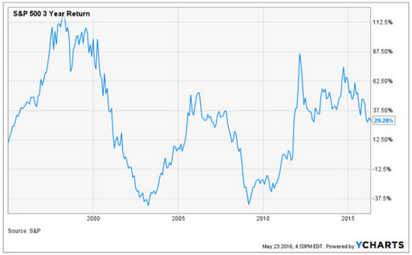
The chart above shows “rolling” three-year returns of the S&P 500. The key point: Broad stock-market returns are cyclical, and investors can’t forget that.
But there are a couple of troughs in the chart that “bear” watching (pun intended). Twice during this period, the three-year return spent a couple of years below the breakeven line. This was all part of the cyclical nature of investing, but it freaked many people out. Now, many of those same people are in retirement or much closer to it than they were in what I call the “twin-killings” (baseball term for a double play) which produced the two lows on the chart.
OK, now that’s the past. What about now? The chartist in me sees a potentially damaging “lower-low” building at the right side of the chart. The three-year return has fallen below 30% for the first time in about four years. Why is this potentially significant? Because as you can see as you look left from that side of the chart, breaching that 30% level to the downside was the beginning of the end of the previous two bull markets.
This is not about speculating or about selling everything. You will not get that type of talk from me.What it is about is taking account of how you (or someone you delegate to) is managing your money. This is a time to employ research, structure, and some ingenuity to navigate through the next few years in a way that preserves retirement and exploits not only the next bear market, but the eventual bull market that follows.”
Rob is absolutely correct. The 30% advance seen in 2013 was a rare anomaly for investors that marked the beginning of substantially lower future returns. This was a point I discussed in detail previously, but here is the important chart.
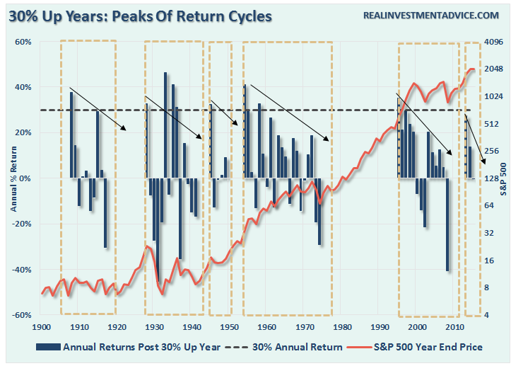
Historically, you will note that huge market surge years of 30% or more, are generally followed by much lower returns in the future until a reversion cycle is generally complete. The near 30% surge in 2013 is likely the beginning of the same such cycle. As Rob notes, much of the price action suggests a more important long-term topping process remains underway.
“Making it and keeping it are two different things” – Anonymous
The Monday Morning Call – Analysis For Active Traders
Almost, but no cigar.
As stated at the start of this week’s missive, the story this past week was the market failing, again, to break and hold above 2100.
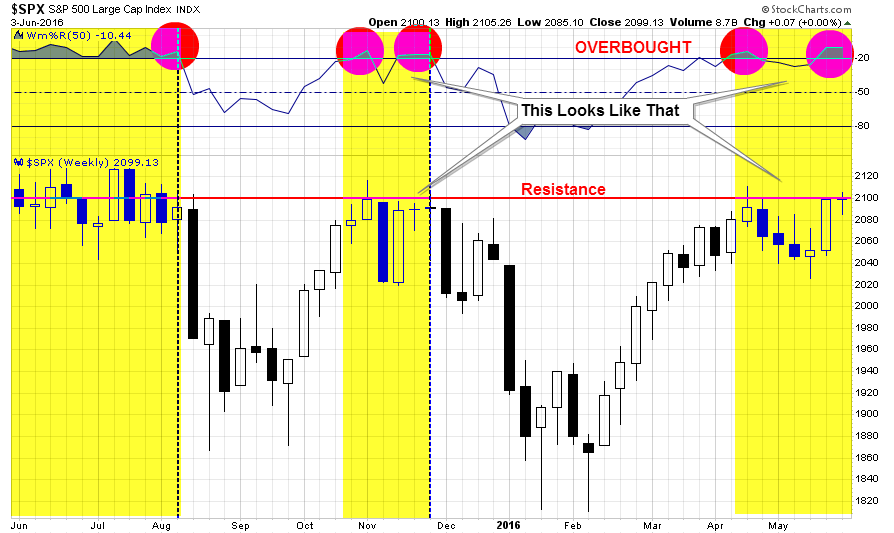
With the market now overbought on a WEEKLY basis, there is little “fuel in the tank” effectively to substantially drive prices higher in the short-term. Therefore, with risk outweighing reward at the moment, a more cautious stance to portfolio management should be considered.
Secondly, IF this market is going to advance towards old highs, it must accomplish a breakout above 2100 on Monday. Otherwise, the overbought condition of the market, combined with a technical failure at resistance, will likely bring sellers into the market.
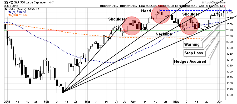
A look at a daily trading chart confirms the same.
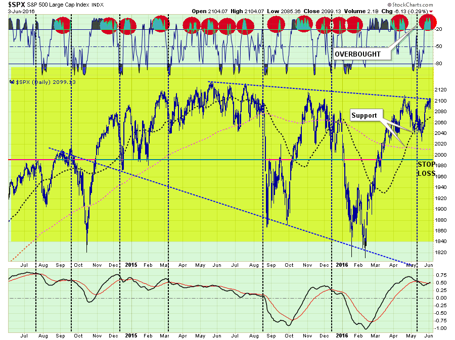
As shown in the top part of the chart above, when the markets are as overbought as they are now, it has generally been at, or near, a peak in the market. With the market still confined in a longer-term broad downtrend, it will require a move to new all-time highs to put the reward/risk ratio back in the favor of investors.
While technically many underpinnings of the market have improved, it has not yet been enough to confirm the“bull market” is back.
Stops & Hedges
I am leaving my stops in place this week at the current support level at 2040 as shown above. However, a break below 2080 next week will send a warning that will likely lead to stops being triggered.
Furthermore, as stated previously, I have also positioned a short-market hedge in portfolios to reduce to overall allocation to market neutral in the event the market breaks 2000. I am leaving that trigger level in place this week as a breach of such level would be a violation of both the 200-dma (currently at 2010) and the psychological support levels of 2000.
Short-term portfolio management instructions currently remain:
- Tighten up stop-loss levels to current support levels for each position.
- Hedge portfolios against major market declines.
- Take profits in positions that have been big winners
- Sell laggards and losers
- Raise cash and rebalance portfolios to target weightings.
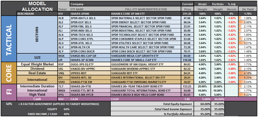
S.A.R.M. Model Allocation
The Sector Allocation Rotation Model (SARM) is an example of a basic well-diversified portfolio. The purpose of the model is to look “under the hood” of a portfolio to see what parts of the engine are driving returns versus detracting from it. From this analysis, we can then determine where to overweight sectors which are leading performance, reduce in areas lagging, and eliminate those areas that are dragging.
Over the last several weeks I have been discussing the move of RISK based sectors which have outpaced performance relative to SAFETY. Starting two weeks ago, that level of outperformance began to fade rather significantly suggesting the risk-based rally was coming to its inevitable conclusion. This week may have been the beginning of that end.
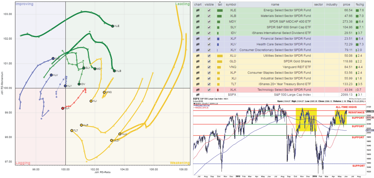
Health Care and Financials continued to improve last week, but Discretionary lost footing slipping back from a previously leading position. While Energy, Basic Materials, Mid-Cap, Small-Cap and International continue to provide leadership, relative outperformance has weakened markedly.
As I stated last week:
“Such action suggests the recently rally last week may well be close to its conclusion.”
LEADING: Energy, Materials, Mid-cap, Small-cap, and International
IMPROVING: Financials, Health Care, and Discretionary
LAGGING: Utilities, Gold, Bonds, Staples, Technology, Industrials, & REITs
The sector comparison chart below shows the 9-major sectors of the S&P 500.
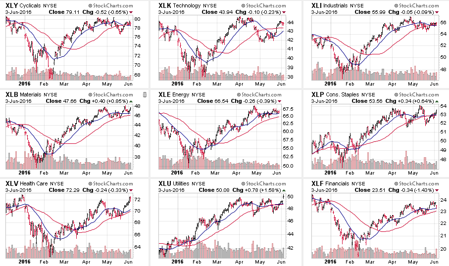
The previous week’s “beta driven” rally was enough to reverse many of the warnings previously discussed by pushing many of the sectors back above their broken short-term moving averages.
However, the Discretionary, Industrial, Energy, Utility, and Financial sectors are all very close to reversing into weakness. Some attention should be paid to these sectors next week.
Furthermore, the large advance in Health Care is likely complete for now which suggests some profit taking and rebalancing in the sector.
The same can be seen in Small-Cap and Mid-Cap stocks where the advance has gone too far too fast in a catch-up rotation move. Bonds also paced a tremendous move last week, as money rotated from equity risk to safety.
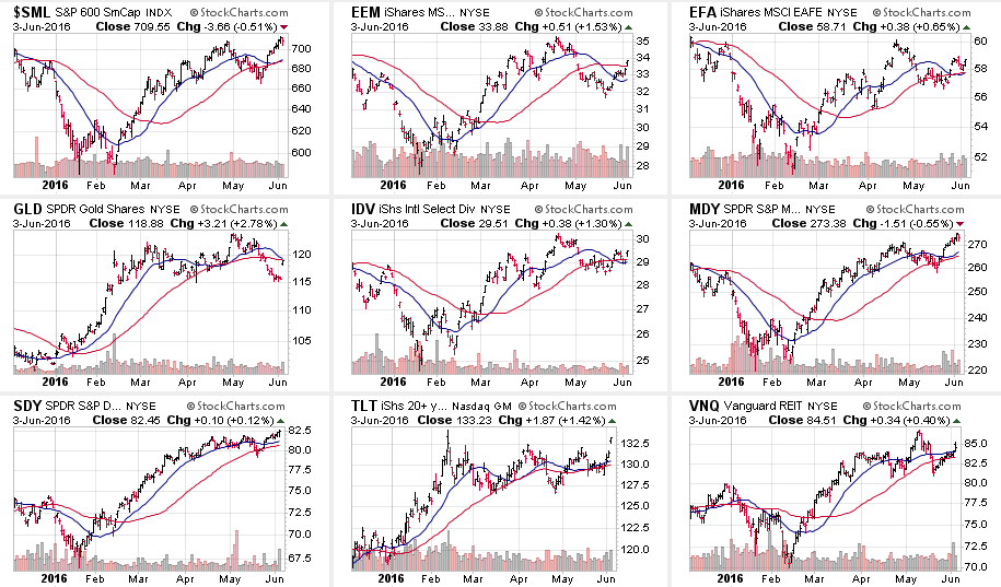
What is particularly interesting is the recent move in “beta related” stocks given the tremendous beating these sectors took the last time the Fed hiked interest rates.
Given the recent spat of weak economic data, the chase for beta is likely a reflection of “bets” being made the Fed will once again “punt” on hiking rates at the next meeting.
S.A.R.M. Sector Analysis & Weighting
As stated above, the SARM Model is an “equally weighted model” adjusted for risk. The current risk weighting remains at 50% this week. It will require a move to new all-time highs in order to safely increase model allocations further at this juncture.
Relative performance of each sector of the model as compared to the S&P 500 is shown below. The table compares each position in the model relative to the benchmark over a 1, 4, 12, 24 and 52-week basis.
Historically speaking, sectors that are leading the markets higher continue to do so in the short-term and vice-versa. The relative improvement or weakness of each sector relative to index over time can show where money is flowing into and out of. Normally, these performance changes signal a change that last several weeks.
As stated above, Bonds, Health Care, and International all improved in relative performance from last week.
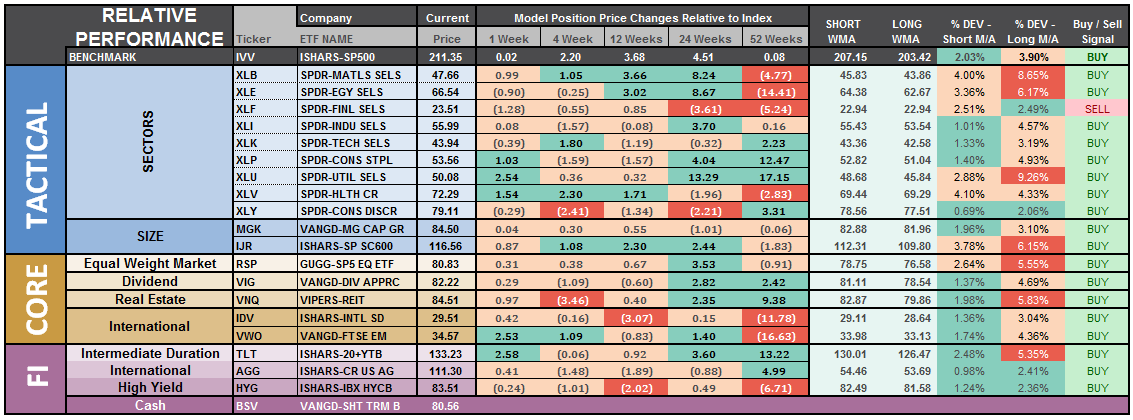
The last column is a sector specific “buy/sell” signal which is simply when the short-term weekly moving average has crossed above or below the long-term weekly average. The number of sectors on “buy signals” has improved from just two a few weeks ago to 18 this past week. Sectors that are on buy signals tend to outperform in the near term.
As I stated above, the technical backdrop of the market has indeed improved. If the market is going to make a break for all-time highs, that time is now.
The risk-adjusted equally weighted model remains from last week. No changes this week.

The portfolio model remains at 35% Cash, 35% Bonds, and 30% in Equities.
As always, this is just a guide, not a recommendation. It is completely OKAY if your current allocation to cash is different based on your personal risk tolerance, time frames, and goals.
For longer-term investors, we need to see an improvement in the fundamental and economic backdrop to support a resumption of the bullish trend. Currently, there is no evidence of that occurring.
The Real 401k Plan Manager – A Conservative Strategy For Long-Term Investors
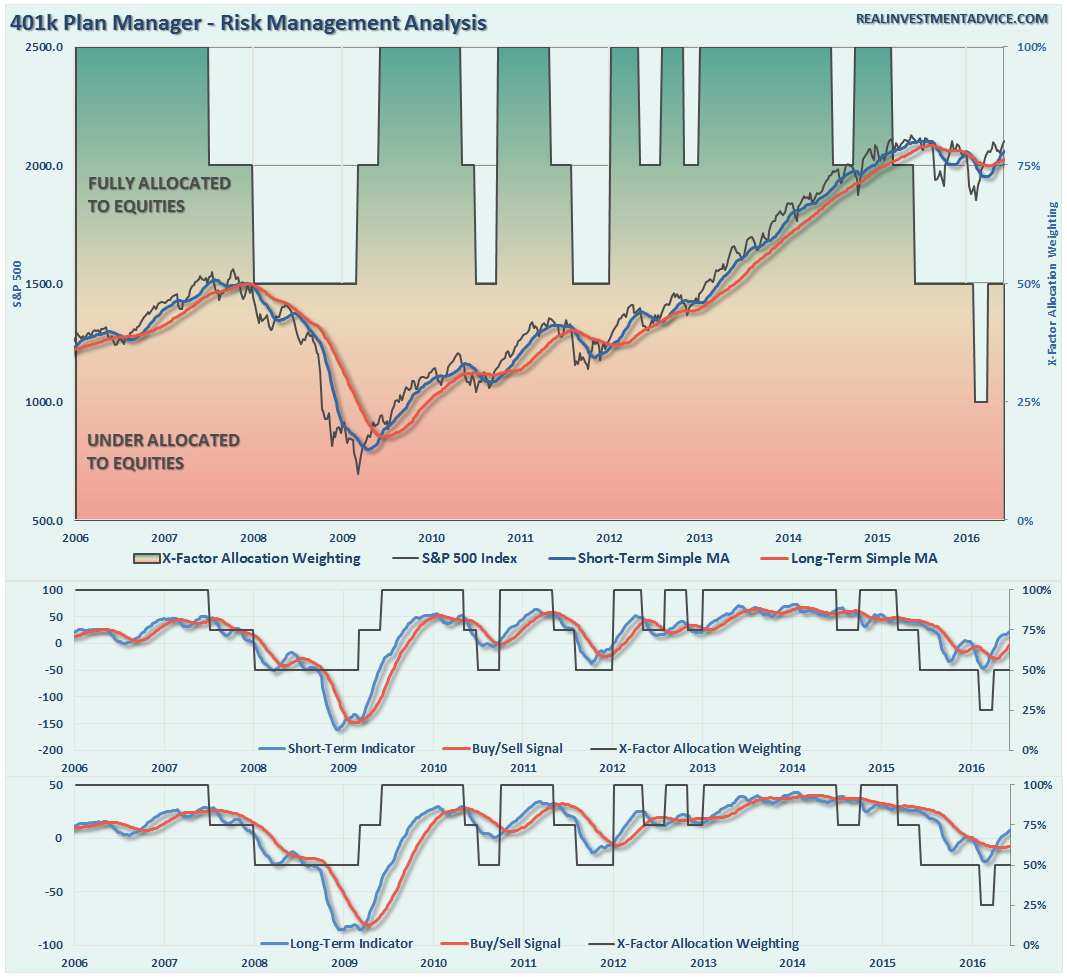
NOTE: I have redesigned the 401k plan manager to accurately reflect the changes in the allocation model over time. I have overlaid the actual model changes on top of the indicators to reflect the timing of the changes relative to the signals.
There are 4-steps to allocation changes based on 25% reduction increments. As noted in the chart above a 100% allocation level is equal to 60% stocks. I never advocate being 100% out of the market as it is far too difficult to reverse course when the market changes from a negative to a positive trend. Emotions keep us from taking the correct action.

No Breakout…Yet
As discussed in the main section of the newsletter, the short-term dynamics improved last week as the market pushed higher to overhead resistance. The negative for the week was the extremely light volume and failure to break above that resistance.
Therefore, there are no changes to the 401k model this week as risk/reward is still not balanced enough to justify taking on additional model risk.
For longer-term investors, the markets have made virtually no progress since January of 2015.Therefore, there is little evidence to suggest stepping away from a more cautionary allocation…for now.
If you need help after reading the alert; don’t hesitate to contact me.
Current 401-k Allocation Model
The 401k plan allocation plan below follows the K.I.S.S. principal. By keeping the allocation extremely simplified it allows for better control of the allocation and a closer tracking to the benchmark objective over time. (If you want to make it more complicated you can, however, statistics show that simply adding more funds does not increase performance to any great degree.)

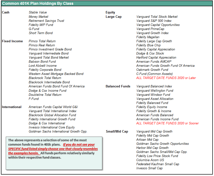
401k Choice Matching List
The list below shows sample 401k plan funds for each major category. In reality, the majority of funds all track their indices fairly closely. Therefore, if you don’t see your exact fund listed, look for a fund that is similar in nature.
Disclosure: The information contained in this article should not be construed as financial or investment advice on any subject matter. Streettalk Advisors, LLC expressly disclaims all liability in ...
more

