
50 Years Of Sharpe Ratio Analysis: Useful But Easily Abused
The Sharpe ratio was introduced half a century ago and it’s still going strong. Although the world is now awash with competitors, the granddaddy of quantitative risk metrics endures. Its longevity and widespread use drives some analysts batty, but for good or ill the SR is deeply embedded into the fabric of risk management discussions and analytics. Part of its appeal is its simplicity, but that can also be a source for abuse. Complexity doesn’t have a monopoly on misguided applications when it comes to risk analysis.
The simplicity aspect is still appealing, even if SR (like every other risk metric) suffers from any number of flaws. Regardless, its charms are hard to resist. Adjusting the real return of an asset or portfolio by its volatility (standard deviation) has inspired countless investors and analysts to look at performance through this prism. The reasoning is sound, since it puts everything on a level playing field, or so one can argue, or so one can argue.
The problem is when you look at SRs as the last word on risk. Rather, it’s merely the opening bid in robust risk analysis. Since every risk metric is flawed, the solution is to deploy a carefully selected batch of analytical tools that, in the aggregate, provide a richer profile.
Another problem with the conventional use of SRs is to look at one data point. A singular focus can be misleading for the simple reason that SRs aren’t stable.
As an example, let’s generate SRs for an S&P 500 index fund–Vanguard 500 Index (VFINX)—and a proxy for US investment-grade government and corporate bonds–Vanguard Intermediate-Term Investment-Grade Fund Investor Shares (VFICX). The sample period runs from the end of 1993 through yesterday (Aug. 3). For simplicity in this toy example, we’ll assume a zero risk-free rate over this stretch. The analytical engine is R, using the PerformanceAnalytics package. The chart below shows the rolling 3-year annualized SRs for the funds. The outstanding feature is the variability of the SRs.
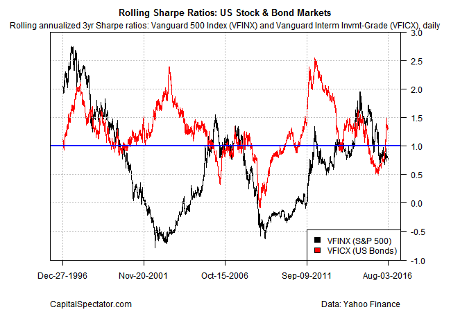
Indeed, VFINX’s SR over the past 20 years has been above 2.5 and below -0.5. VFICX’s range has varied far and wide as well. At different times, one or the other portfolio enjoyed a higher SR. Recall that higher SRs are better, reflecting a higher return for a given level of risk (volatility). The point is that it’s highly misleading to take the current trailing 3-year SR at any given point in time as gospel.
The variability also suggests that defining “good” and “bad” for SRs is as much an art as it is a science. There’s no easy solution for interpretation, but it’s useful to look at SRs in context. The chart above is one example. But it would also be helpful to compare SRs for competing funds within an asset class. For instance, how do large-cap and small-cap equity funds stack up in terms of SRs?
Meanwhile, some analysts point to unorthodox applications of SRs–for use with tactical asset allocation, for instance. A 2011 study finds that SRs in general “are low at the peak of the cycle and high at the trough.” The paper (“Time-Varying Sharpe Ratios and Market Timing”) demonstrates that “an out-of-sample analysis, using 10-year rolling regressions, relatively naive market-timing strategies that exploit this predictability can identify periods with Sharpe ratios more than 45% larger than the full sample value.”
A hint of that point can be seen in the chart above. For instance, the S&P 500 index fund’s SR bottomed out near the nadir of the two bear markets for stocks in the previous decade.
All the usual caveats apply, of course. In any case, the larger point is that SRs, even after 50 years, are still a worthy component for slicing and dicing risk. But even a useful risk metric doesn’t make it foolproof or flawless.
Disclosure: None.


